Finding patterns in construction project drawing creation dates

Derek Jones from The Shape of Code

I took part in Projecting Success‘s 13th hackathon last Thursday and Friday, at CodeNode (host to many weekend hackathons and meetups); around 200 people turned up for the first day. Team Designing-Success included Imogen, Ryan, Dillan, Mo, Zeshan (all building construction domain experts) and yours truly (a data analysis monkey who knows nothing about construction).

One of the challenges came with lots of real multi-million pound building construction project data (two csv files containing 60K+ rows and one containing 15K+ rows), provided by SISK. The data contained information on project construction drawings and RFIs (request for information) from 97 projects.

The construction industry is years ahead of the software industry in terms of collecting data, in that lots of companies actually collect data (for some, accumulate might be a better description) rather than not collecting/accumulating data. While they have data, they don’t seem to be making good use of it (so I am told).

Nearly all the discussions I have had with domain experts about the patterns found in their data have been iterative, brief email exchanges, sometimes running over many months. In this hack, everybody involved is sitting around the same table for two days, i.e., the conversation is happening in real-time and there is a cut-off time for delivery of results.

I got the impression that my fellow team-mates were new to this kind of data analysis, which is my usual experience when discussing patterns recently found in data. My standard approach is to start highlighting visual patterns present in the data (e.g., plot foo against bar), and hope that somebody says “That’s interesting” or suggests potentially more interesting items to plot.

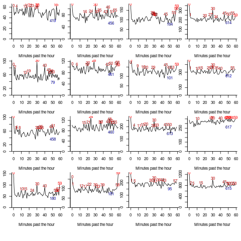
After several dead-end iterations (i.e., plots that failed to invoke a “that’s interesting” response), drawings created per day against project duration (as a percentage of known duration) turned out to be of great interest to the domain experts.

Building construction uses a waterfall process; all the drawings (i.e., a kind of detailed requirements) are supposed to be created at the beginning of the project.

Hmm, many individual project drawing plots were showing quite a few drawings being created close to the end of the project. How could this be? It turns out that there are lots of different reasons for creating a drawing (74 reasons in the data), and that it is to be expected that some kinds of drawings are likely to be created late in the day, e.g., specific landscaping details. The 74 reasons were mapped to three drawing categories (As built, Construction, and Design Development), then project drawings were recounted and plotted in three colors (see below).

The domain experts (i.e., everybody except me) enjoyed themselves interpreting these plots. I nodded sagely, and occasionally blew my cover by asking about an acronym that everybody in the construction obviously knew.

The project meta-data includes a measure of project performance (a value between one and five, derived from profitability and other confidential values) and type of business contract (a value between one and four). The data from the 97 projects was combined by performance and contract to give 20 aggregated plots. The evolution of the number of drawings created per day might vary by contract, and the hypothesis was that projects at different performance levels would exhibit undesirable patterns in the evolution of the number of drawings created.

The plots below contain patterns in the quantity of drawings created by percentage of project completion, that are: (left) considered a good project for contract type 1 (level 5 are best performing projects), and (right) considered a bad project for contract type 1 (level 1 is the worst performing project). Contact the domain experts for details (code+data):

Number of drawings created at percentage project completion times.

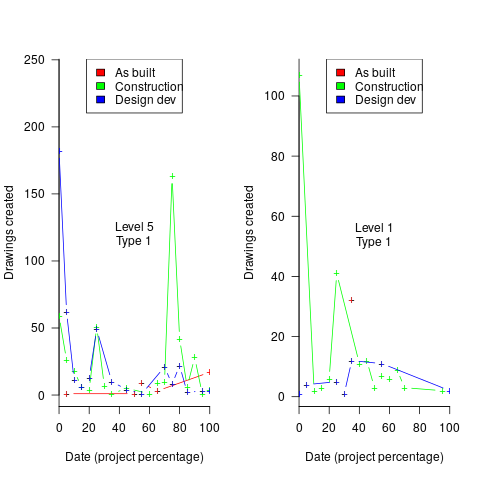
The path to the above plot is a common one: discover an interesting pattern in data, notice that something does not look right, use domain knowledge to refine the data analysis (e.g., kinds of drawing or contract), rinse and repeat.

My particular interest is using data to understand software engineering processes. How do these patterns in construction drawings compare with patterns in the software project equivalents, e.g., detailed requirements?

I am not aware of any detailed public data on requirements produced using a waterfall process. So the answer is, I don’t know; but the rationales I heard for the various kinds of drawings sound as-if they would have equivalents in the software requirements world.

What about the other data provided by the challenge sponsor?

I plotted various quantities for the RFI data, but there wasn’t any “that’s interesting” response from the domain experts. Perhaps the genius behind the plot ideas will be recognized later, or perhaps one of the domain experts will suddenly realize what patterns should be present in RFI data on high performance projects (nobody is allowed to consider the possibility that the data has no practical use). It can take time for the consequences of data analysis to sink in, or for new ideas to surface, which is why I am happy for analysis conversations to stretch out over time. Our presentation deck included some RFI plots because there was RFI data in the challenge.

What is the software equivalent of construction RFIs? Perhaps issues in a tracking system, or Jira tickets? I did not think to talk more about RFIs with the domain experts.

How did team Designing-Success do?

In most hackathons, the teams that stay the course present at the end of the hack. For these ProjectHacks, submission deadline is the following day; the judging is all done later, electronically, based on the submitted slide deck and video presentation. The end of this hack was something of an anti-climax.

Did team Designing-Success discover anything of practical use?

I think that finding patterns in the drawing data converted the domain experts from a theoretical to a practical understanding that it was possible to extract interesting patterns from construction data. They each said that they planned to attend the next hack (in about four months), and I suggested that they try to bring some of their own data.

Can these drawing creation patterns be used to help monitor project performance, as it progressed? The domain experts thought so. I suspect that the users of these patterns will be those not closely associated with a project (those close to a project are usually well aware of that fact that things are not going well).

Moore’s law was a socially constructed project

Derek Jones from The Shape of Code

Moore’s law was a socially constructed project that depended on the coordinated actions of many independent companies and groups of individuals to last for as long it did.

All products evolve, but what was it about Moore’s law that enabled microelectronics to evolve so much faster and for longer than most other products?

Moore’s observation, made in 1965 based on four data points, was that the number of components contained in a fabricated silicon device doubles every year. The paper didn’t make this claim in words, but a line fitted to four yearly data points (starting in 1962) suggested this behavior continuing into the mid-1970s. The introduction of IBM’s Personal Computer, in 1981 containing Intel’s 8088 processor, led to interested parties coming together to create a hugely profitable ecosystem that depended on the continuance of Moore’s law.

The plot below shows Moore’s four points (red) and fitted regression model (green line). In practice, since 1970, fitting a regression model (purple line) to the number of transistors in various microprocessors (blue/green, data from Wikipedia), finds that the number of transistors doubled every two years (code+data):

Transistors contained in a device over time, plus Moore's original four data-points.

In the early days, designing a device was mostly a manual operation; that is, the circuit design and logic design down to the transistor level were hand-drawn. This meant that creating a device containing twice as many transistors required twice as many engineers. At some point the doubling process either becomes uneconomic or it takes forever to get anything done because of the coordination effort.

The problem of needing an exponentially-growing number of engineers was solved by creating electronic design automation tools (EDA), starting in the 1980s, with successive generations of tools handling ever higher levels of abstraction, and human designers focusing on the upper levels.

The use of EDA provides a benefit to manufacturers (who can design differentiated products) and to customers (e.g., products containing more functionality).

If EDA had not solved the problem of exponential growth in engineers, Moore’s law would have maxed-out in the early 1980s, with around 150K transistors per device. However, this would not have stopped the ongoing shrinking of transistors; two economic factors independently incentivize the creation of ever smaller transistors.

When wafer fabrication technology improvements make it possible to double the number of transistors on a silicon wafer, then around twice as many devices can be produced (assuming unchanged number of transistors per device, and other technical details). The wafer fabrication cost is greater (second row in table below), but a lot less than twice as much, so the manufacturing cost per device is much lower (third row in table).

The doubling of transistors primarily provides a manufacturer benefit.

The following table gives estimates for various chip foundry economic factors, in dollars (taken from the report: AI Chips: What They Are and Why They Matter). Node, expressed in nanometers, used to directly correspond to the length of a particular feature created during the fabrication process; these days it does not correspond to the size of any specific feature and is essentially just a name applied to a particular generation of chips.

Node (nm)                       90      65     40     28      20    16/12     10       7       5
Foundry sale price per wafer  1,650   1,937  2,274  2,891   3,677   3,984   5,992   9,346  16,988
Foundry sale price per chip   2,433   1,428    713    453     399     331     274     233     238
Mass production year          2004    2006   2009   2011    2014    2015    2017    2018   2020
Quarter                        Q4      Q4     Q1     Q4      Q3      Q3      Q2      Q3     Q1
Capital investment per wafer  4,649   5,456  6,404  8,144  10,356  11,220  13,169  14,267  16,746
processed per year
Capital consumed per wafer      411     483    567    721     917     993   1,494   2,330   4,235
processed in 2020
Other costs and markup        1,293   1,454  1,707  2,171   2,760   2,990   4,498   7,016  12,753
per wafer

The second economic factor incentivizing the creation of smaller transistors is Dennard scaling, a rarely heard technical term named after the first author of a 1974 paper showing that transistor power consumption scaled with area (for very small transistors). Halving the area occupied by a transistor, halves the power consumed, at the same frequency.

The maximum clock-frequency of a microprocessor is limited by the amount of heat it can dissipate; the heat produced is proportional to the power consumed, which is approximately proportional to the clock-frequency. Instead of a device having smaller transistors consume less power, they could consume the same power at double the frequency.

Dennard scaling primarily provides a customer benefit.

Figuring out how to further shrink the size of transistors requires an investment in research, followed by designing/(building or purchasing) new equipment. Why would a company, who had invested in researching and building their current manufacturing capability, be willing to invest in making it obsolete?

The fear of losing market share is a commercial imperative experienced by all leading companies. In the microprocessor market, the first company to halve the size of a transistor would be able to produce twice as many microprocessors (at a lower cost) running twice as fast as the existing products. They could (and did) charge more for the latest, faster product, even though it cost them less than the previous version to manufacture.

Building cheaper, faster products is a means to an end; that end is receiving a decent return on the investment made. How large is the market for new microprocessors and how large an investment is required to build the next generation of products?

Rock’s law says that the cost of a chip fabrication plant doubles every four years (the per wafer price in the table above is increasing at a slower rate). Gambling hundreds of millions of dollars, later billions of dollars, on a next generation fabrication plant has always been a high risk/high reward investment.

The sales of microprocessors are dependent on the sale of computers that contain them, and people buy computers to enable them to use software. Microprocessor manufacturers thus have to both convince computer manufacturers to use their chip (without breaking antitrust laws) and convince software companies to create products that run on a particular processor.

The introduction of the IBM PC kick-started the personal computer market, with Wintel (the partnership between Microsoft and Intel) dominating software developer and end-user mindshare of the PC compatible market (in no small part due to the billions these two companies spent on advertising).

An effective technique for increasing the volume of microprocessors sold is to shorten the usable lifetime of the computer potential customers currently own. Customers buy computers to run software, and when new versions of software can only effectively be used in a computer containing more memory or on a new microprocessor which supports functionality not supported by earlier processors, then a new computer is needed. By obsoleting older products soon after newer products become available, companies are able to evolve an existing customer base to one where the new product is looked upon as the norm. Customers are force marched into the future.

The plot below shows sales volume, in gigabytes, of various sized DRAM chips over time. The simple story of exponential growth in sales volume (plus signs) hides the more complicated story of the rise and fall of succeeding generations of memory chips (code+data):

Sales volume, in gigabytes, of various sized DRAM chips over time.

The Red Queens had a simple task, keep buying the latest products. The activities of the companies supplying the specialist equipment needed to build a chip fabrication plant has to be coordinated, a role filled by the International Technology Roadmap for Semiconductors (ITRS). The annual ITRS reports contain detailed specifications of the expected performance of the subsystems involved in the fabrication process.

Moore’s law is now dead, in that transistor doubling now takes longer than two years. Would transistor doubling time have taken longer than two years, or slowed down earlier, if:

  • the ecosystem had not been dominated by two symbiotic companies, or did network effects make it inevitable that there would be two symbiotic companies,
  • the Internet had happened at a different time,
  • if software applications had quickly reached a good enough state,
  • if cloud computing had gone mainstream much earlier.

Including natural language text topics in a regression model

Derek Jones from The Shape of Code

The implementation records for a project sometimes include a brief description of each task implemented. There will be some degree of similarity between the implementation of some tasks. Is it possible to calculate the degree of similarity between tasks from the text in the task descriptions?

Over the years, various approaches to measuring document similarity have been proposed (more than you probably want to know about natural language processing).

One of the oldest, simplest and widely used technique is term frequency–inverse document frequency (tf-idf), which is based on counting word frequencies, i.e., is word context is ignored. This technique can work well when there are a sufficient number of words to ensure a good enough overlap between similar documents.

When the description consists of a sentence or two (i.e., a summary), the problem becomes one of sentence similarity, not document similarity (so tf-idf is unlikely to be of any use).

Word context, in a sentence, underpins the word embedding approach, which represents a word by an n-dimensional vector calculated from the local sentence context in which the word occurs (derived from a large amount of text). Words that are closer, in this vector space, are expected to have similar meanings. One technique for calculating the similarity between sentences is to compare the averages of the word embedding of the words they contain. However, care is needed; words appearing in the same context can create sentences having different meanings, as in the following (calculated sentence similarity in the comments):

import spacy
nlp=spacy.load("en_core_web_md") # _md model needed for word vectors
nlp("the screen is black").similarity(nlp("the screen is white"))
# 0.9768339369182919  # closer to 1 the more similar the sentences
nlp("implementing widgets would be little effort").similarity(nlp("implementing widgets would be a huge effort"))
# 0.9636533803238744
nlp("the screen is black").similarity(nlp("implementing widgets would be a huge effort"))
# 0.6596892830922606

The first pair of sentences are similar in that they are about the characteristics of an object (i.e., its colour), while the second pair are similar in that are about the quantity of something (i.e., implementation effort), and the third pair are not that similar.

The words in a document, or summary, are about some collection of topics. A set of related documents are likely to contain a discussion of a set of related topics in varying degrees. Latent Dirichlet allocation (LDA) is a widely used technique for calculating a set of (unseen) topics from a set of documents and their contained words.

A recent paper attempted to estimate task effort based on the similarity of the task descriptions (using tf-idf). My last semi-serious attempt to extract useful information from text, some years ago, was a miserable failure (it’s a very hard problem). Perhaps better techniques and tools are now available for me to leverage.

My initial idea was to extract topics from task data, and then try to add these to regression models of task effort estimation, to see what impact they had. Searching to find out what researchers have recently been doing in this area, I was pleased to see that others were ahead of me, and had implemented R packages to do the heavy lifting, in particular:

  • The stm package supports the creation of Structural Topic Models; these add support for covariates to influence the process of fitting LDA models, i.e., a correlation between the topics and other variables in the data. Uses of STM appear to be oriented towards teasing out differences in topics associated with different values of some variable (e.g., political party), and the package authors have written papers analysing political data.
  • The psychtm package supports what the authors call supervised latent Dirichlet allocation with covariates (SLDAX). This handles all the details needed to include the extracted LDA topics in a regression model; exactly what I was after. The user interface and documentation for this package is not as polished as the stm package, but the code held together as I fumbled my way through.

To experiment using these two packages I used the SiP dataset, which includes summary text for each task, and I have previously analysed the estimation task data.

The stm package:

The textProcessor function handles all the details of converting a vector of strings (e.g., summary text) to internal form (i.e., handling conversion to lower case, removing stop words, stemming, etc).

One of the input variables to the LDA process is the number of topics to use. Picking this value is something of a black art, and various functions are available for calculating and displaying concepts such as topic semantic coherence and exclusivity, the most commonly used words associated with a topic, and the documents in which these topics occur. Deciding the extent to which 10 or 15 topics produced the best results (values that sounded like a good idea to me) required domain knowledge that I did not have. The plot below shows the extent to which the words in topic 5 were associated with the Category column having the value “Development” or “Management” (code+data):

Distribution of words contained in topics associated with Development and Management.

The psychtm package:

The prep_docs function is not as polished as the equivalent stm function, but the package’s first release was just last year.

After the data has been prepared, the call to fit a regression model that includes the LDA extracted topics is straightforward:

sip_topic_mod=gibbs_sldax(log(HoursActual) ~ log(HoursEstimate), data = cl_info,
                         docs = docs_vocab$documents, model = "sldax",
                         K = 10 # number of topics)

where: log(HoursActual) ~ log(HoursEstimate) is the simplest model fitted in the original analysis.

The fitted model had the form: HoursActual approx HoursEstimate^{0.81} e^{0.13 topic_1} e^{0.18 topic_2}..., with the calculated coefficient for some topics not being significant. The value 0.81 is close to that fitted in the original model. The value of topic_i is the fraction of the topic_i calculated to be present in the Summary text of the corresponding task.

I’m please to see that a regression model can be improved by adding topics derived from the Summary text.

The SiP data includes other information such as work Category (e.g., development, management), ProjectCode and DeveloperId. It is to be expected that these factors will have some impact on the words appearing in a task Summary, and hence the topics (the stm analysis showed this effect for Category).

When the model formula is changed to: log(HoursActual) ~ log(HoursEstimate)+ProjectCode, the quality of fit for most topics became very poor. Is this because ProjectCode and topics conveyed very similar information, or did I need to be more sophisticated when extracting topic models? This needs further investigation.

Can topic models be used to build prediction models?

Summary text can only be used to make predictions if it is available before the event being predicted, e.g., available before a task is completed and the actual effort is known.

My own habit is to update, or even create Summary text once a task is complete. I asked Stephen Cullen, my co-author on the original analysis and author of many of the Summary texts, about the process of creating the SiP Summary sentences. His reply was that the Summary field was an active document that was updated over time. I suspect the same is true for many task descriptions.

Not all estimation data includes as much information as the SiP dataset. If Summary text is one of the few pieces of information available, it may be possible to use it as a proxy for missing columns.

Perhaps it is possible to extract information from the SiP Summary text that is not also contained in the other recorded information. Having been successful this far, I will continue to investigate.

Tracking software evolution via its Changelog

Derek Jones from The Shape of Code

Software that is used evolves. How fast does software evolve, e.g., much new functionality is added and how much existing functionality is updated?

A new software release is often accompanied by a changelog which lists new, changed and deleted functionality. When software is developed using a continuous release process, the changelog can be very fine-grained.

The changelog for the Beeminder app contains 3,829 entries, almost one per day since February 2011 (around 180 entries are not present in the log I downloaded, whose last entry is numbered 4012).

Is it possible to use the information contained in the Beeminder changelog to estimate the rate of growth of functionality of Beeminder over time?

My thinking is driven by patterns in a plot of the Renzo Pomodoro dataset. Renzo assigned a tag-name (sometimes two) to each task, which classified the work involved, e.g., @planning. The following plot shows the date of use of each tag-name, over time (ordered vertically by first use). The first and third black lines are fitted regression models of the form 1-e^{-K*days}, where: K is a constant and days is the number of days since the start of the interval fitted; the second (middle) black line is a fitted straight line.

at-words usage, by date.

How might a changelog line describing a day’s change be distilled to a much shorter description (effectively a tag-name), with very similar changes mapping to the same description?

Named-entity recognition seemed like a good place to start my search, and my natural language text processing tool of choice is still spaCy (which continues to get better and better).

spaCy is Python based and the processing pipeline could have all been written in Python. However, I’m much more fluent in awk for data processing, and R for plotting, so Python was just used for the language processing.

The following shows some Beeminder changelog lines after stripping out urls and formatting characters:

Cheapo bug fix for erroneous quoting of number of safety buffer days for weight loss graphs.
Bugfix: Response emails were accidentally off the past couple days; fixed now. Thanks to user bmndr.com/laur  for alerting us!  
More useful subject lines in the response emails, like "wrong lane!" or whatnot.
Clearer/conciser stats at bottom of graph pages. (Will take effect when you enter your next datapoint.) Progress, rate, lane, delta.  
Better handling of significant digits when displaying numbers. Cf stackoverflow.com/q/5208663

The code to extract and print the named-entities in each changelog line could not be simpler.

import spacy
import sys

nlp = spacy.load("en_core_web_sm") # load trained English pipelines

count=0 
        
for line in sys.stdin:
   count += 1 
   print(f'> {count}: {line}')
#
   doc=nlp(line) # do the heavy lifting
#          
   for ent in doc.ents:  # iterate over detected named-entities
      print(ent.lemma_, ent.label_)

To maximize the similarity between named-entities appearing on different lines the lemmas are printed, rather than original text (i.e., words appear in their base form).

The label_ specifies the kind of named-entity, e.g., person, organization, location, etc.

This code produced 2,225 unique named-entities (5,302 in total) from the Beeminder changelog (around 0.6 per day), and failed to return a named-entity for 33% of lines. I was somewhat optimistically hoping for a few hundred unique named-entities.

There are several problems with this simple implementation:

  • each line is considered in isolation,
  • the change log sometimes contains different names for the same entity, e.g., a person’s full name, Christian name, or twitter name,
  • what appear to be uninteresting named-entities, e.g., numbers and dates,
  • the language does not know much about software, having been training on a corpus of general English.

Handling multiple names for the same entity would a lot of work (i.e., I did nothing), ‘uninteresting’ named-entities can be handled by post-processing the output.

A language processing pipeline that is not software-concept aware is of limited value. spaCy supports adding new training models, all I need is a named-entity model trained on manually annotated software engineering text.

The only decent NER training data I could find (trained on StackOverflow) was for BERT (another language processing tool), and the data format is very different. Existing add-on spaCy models included fashion, food and drugs, but no software engineering.

Time to roll up my sleeves and create a software engineering model. Luckily, I found a webpage that provided a good user interface to tagging sentences and generated the json file used for training. I was patient enough to tag 200 lines with what I considered to be software specific named-entities. … and now I have broken the NER model I built…

The following plot shows the growth in the total number of named-entities appearing in the changelog, and the number of unique named-entities (with the 1,996 numbers and dates removed; code+data);

Growth of total and unique named-entities in the Beeminder changelog.

The regression fits (red lines) are quadratics, slightly curving up (total) and down (unique); the linear growth components are: 0.6 per release for total, and 0.46 for unique.

Including software named-entities is likely to increase the total by at least 15%, but would have little impact on the number of unique entries.

This extraction pipeline processes one release line at a time. Building a set of Beeminder tag-names requires analysing the changelog as a whole, which would take a lot longer than the day spent on this analysis.

The Beeminder developers have consistently added new named-entities to the changelog over more than eleven years, but does this mean that more features have been consistently added to the software (or are they just inventing different names for similar functionality)?

It is not possible to answer this question without access to the code, or experience of using the product over these eleven years.

However, staying in business for eleven years is a good indicator that the developers are doing something right.

Join a crowdsourced search for software engineering data

Derek Jones from The Shape of Code

Software engineering data, that can be made publicly available, is very rare; most people don’t attempt to collect data, and when data is collected, people rarely make any attempt to hang onto the data they do collect.

Having just one person actively searching for software engineering data (i.e., me) restricts potential sources of data to be English speaking and to a subset of development ecosystems.

This post is my attempt to start a crowdsourced campaign to search for software engineering data.

Finding data is about finding the people who have the data and have the authority to make it available (no hacking into websites).

Who might have software engineering data?

In the past, I have emailed chief technology officers at companies with less than 100 employees (larger companies have lawyers who introduce serious amounts of friction into releasing company data), and this last week I have been targeting Agile coaches. For my evidence-based software engineering book I mostly emailed the authors of data driven papers.

A lot of software is developed in India, China, South America, Russia, and Europe; unless these developers are active in the English-speaking world, I don’t see them.

If you work in one of these regions, you can help locate data by finding people who might have software engineering data.

If you want to be actively involved, you can email possible sources directly, alternatively I can email them.

If you want to be actively involved in the data analysis, you can work on the analysis yourself, or we can do it together, or I am happy to do it.

In the English-speaking development ecosystems, my connection to the various embedded ecosystems is limited. The embedded ecosystems are huge, there must be software data waiting to be found. If you are active within an embedded ecosystem, you can help locate data by finding people who might have software engineering data.

The email template I use for emailing people is below. The introduction is intended to create a connection with their interests, followed by a brief summary of my interest, examples of previous analysis, and the link to my book to show the depth of my interest.

By all means cut and paste this template, or create one that you feel is likely to work better in your environment. If you have a blog or Twitter feed, then tell them about it and why you think that evidence-based software engineering is important.

Be responsible and only email people who appear to have an interest in applying data analysis to software engineering. Don’t spam entire development groups, but pick the person most likely to be in a position to give a positive response.

This is a search for gold nuggets, and the response rate will be very low; a 10% rate of reply, saying sorry not data, would be better than what I get. I don’t have enough data to be able to calculate a percentage, but a ballpark figure is that 1% of emails might result in data.

I treat the search as a background task, taking months to locate and email, say, 100-people considered worth sending a targeted email. My experience is that I come up with a search idea or encounter a blog post that suggests a line of enquiry, that may result in sending half-a-dozen emails. The following week, if I’m lucky, the same thing might happen again (perhaps with fewer emails). It’s a slow process.

If people want to keep a record of ideas tried, the evidence-based software engineering Slack channel could do with some activity.

Hello,

A personalized introduction, such as: I have been reading
your blog posts on XXX, your tweets about YYY,
your youtube video on ZZZ.

My interest is in trying to figure out the human issues
driving the software process.

Here are two detailed analysis of Agile estimation data:
https://arxiv.org/abs/1901.01621
and
https://arxiv.org/abs/2106.03679

My book Evidence-based Software Engineering discusses what is
currently known about software engineering, based on an
analysis of all the publicly available data.
pdf+code+all data freely available here:
http://knosof.co.uk/ESEUR/

and I'm always on the lookout for more software data.
This email is a fishing request for software engineering data.

I offer a free analysis of software data, provided an
anonymised version of the data can be made public.

Creating and evolving a programming language: funding

Derek Jones from The Shape of Code

The funding for artists and designers/implementors of programming languages shares some similarities.

Rich patrons used to sponsor a few talented painters/sculptors/etc, although many artists had no sponsors and worked for little or no money. Designers of programming languages sometimes have a rich patron, in the form of a company looking to gain some commercial advantage, with most language designers have a day job and work on their side project that might have a connection to their job (e.g., researchers).

Why would a rich patron sponsor the creation of an art work/language?

Possible reasons include: Enhancing the patron’s reputation within the culture in which they move (attracting followers, social or commercial), and influencing people’s thinking (to have views that are more in line with those of the patron).

The during 2009-2012 it suddenly became fashionable for major tech companies to have their own home-grown corporate language: Go, Rust, Dart and Typescript are some of the languages that achieved a notable level of brand recognition. Microsoft, with its long-standing focus on developers, was ahead of the game, with the introduction of F# in 2005 (and other languages in earlier and later years). The introduction of Swift and Hack in 2014 were driven by solid commercial motives (i.e., control of developers and reduced maintenance costs respectively); Google’s adoption of Kotlin, introduced by a minor patron in 2011, was driven by their losing of the Oracle Java lawsuit.

Less rich patrons also sponsor languages, with the idiosyncratic Ivor Tiefenbrun even sponsoring the creation of a bespoke cpu to speed up the execution of programs written in the company language.

The benefits of having a rich sponsor is the opportunity it provides to continue working on what has been created, evolving it into something new.

Self sponsored individuals and groups also create new languages, with recent more well known examples including Clojure and Julia.

What opportunities are available for initially self sponsored individuals to support themselves, while they continue to work on what has been created?

The growth of the middle class, and its interest in art, provided a means for artists to fund their work by attracting smaller sums from a wider audience.

In the last 10-15 years, some language creators have fostered a community driven approach to evolving and promoting their work. As well as being directly involved in working on the language and its infrastructure, members of a community may also contribute or help raise funds. There has been a tiny trickle of developers leaving their day job to work full time on ‘their’ language.

The term Hedonism driven development is a good description of this kind of community development.

People have been creating new languages since computers were invented, and I don’t expect this desire to create new languages to stop anytime soon. How long might a language community be expected to last?

Having lots of commercially important code implemented in a language creates an incentive for that language’s continual existence, e.g., companies paying for support. When little or co commercial important code is available to create an external incentive, a language community will continue to be active for as long as its members invest in it. The plot below shows the lifetime of 32 secular and 19 religious 19th century American utopian communities, based on their size at foundation; lines are fitted loess regression (code+data):

Size at foundation and lifetime of 32 secular and 19 religious 19th century American utopian communities; lines are fitted loess regression.

How many self-sustaining language communities are there, and how many might the world’s population support?

My tracking of new language communities is a side effect of the blogs I follow and the few community sites a visit regularly; so a tiny subset of the possibilities. I know of a handful of ‘new’ language communities; with ‘new’ as in not having a Wikipedia page (yet).

One list contains, up until 2005, 7,446 languages. I would not be surprised if this was off by almost an order of magnitude. Wikipedia has a very idiosyncratic and brief timeline of programming languages, and a very incomplete list of programming languages.

I await a future social science PhD thesis for a more thorough analysis of current numbers.

Fishing for software data

Derek Jones from The Shape of Code

During 2021 I sent around 100 emails whose first line started something like: “I have been reading your interesting blog post…”, followed by some background information, and then a request for software engineering data. Sometimes the request for data was specific (e.g., the data associated with the blog post), and sometimes it was a general request for any data they might have.

So far, these 100 email requests have produced one dataset. Around 80% failed to elicit a reply, compared to a 32% no reply for authors of published papers. Perhaps they don’t have any data, and don’t think a reply is worth the trouble. Perhaps they have some data, but it would be a hassle to get into a shippable state (I like this idea because it means that at least some people have data). Or perhaps they don’t understand why anybody would be interested in data and must be an odd-ball, and not somebody they want to engage with (I may well be odd, but I don’t bite :-).

Some of those who reply, that they don’t have any data, tell me that they don’t understand why I might be interested in data. Over my entire professional career, in many other contexts, I have often encountered surprise that data driven problem-solving increases the likelihood of reaching a workable solution. The seat of the pants approach to problem-solving is endemic within software engineering.

Others ask what kind of data I am interested in. My reply is that I am interested in human software engineering data, pointing out that lots of Open source is readily available, but that data relating to the human factors underpinning software development is much harder to find. I point them at my evidence-based book for examples of human centric software data.

In business, my experience is that people sometimes get in touch years after hearing me speak, or reading something I wrote, to talk about possible work. I am optimistic that the same will happen through my requests for data, i.e., somebody I emailed will encounter some data and think of me 🙂

What is different about 2021 is that I have been more willing to fail, and not just asking for data when I encounter somebody who obviously has data. That is to say, my expectation threshold for asking is lower than previous years, i.e., I am more willing to spend a few minutes crafting a targeted email on what appear to be tenuous cases (based on past experience).

In 2022 I plan to be even more active, in particular, by giving talks and attending lots of meetups (London based). If your company is looking for somebody to give an in-person lunchtime talk, feel free to contact me about possible topics (I’m always after feedback on my analysis of existing data, and will take a 10-second appeal for more data).

Software data is not commonly available because most people don’t collect data, and when data is collected, no thought is given to hanging onto it. At the moment, I don’t think it is possible to incentivize people to collect data (i.e., no saleable benefit to offset the cost of collecting it), but once collected the cost of hanging onto data is peanuts. So as well as asking for data, I also plan to sell the idea of hanging onto any data that is collected.

Fishing tips for software data welcome.

Christmas books for 2021

Derek Jones from The Shape of Code

This year, my list of Christmas books is very late because there is only one entry (first published in 1950), and I was not sure whether a 2021 Christmas book post was worthwhile.

The book is “Planning in Practice: Essays in Aircraft planning in war-time” by Ely Devons. A very readable, practical discussion, with data, on the issues involved in large scale planning; the discussion is timeless. Check out second-hand book sites for low costs editions.

Why isn’t my list longer?

Part of the reason is me. I have not been motivated to find new topics to explore, via books rather than blog posts. Things are starting to change, and perhaps the list will be longer in 2022.

Another reason is the changing nature of book publishing. There is rarely much money to be made from the sale of non-fiction books, and the desire to write down their thoughts and ideas seems to be the force that drives people to write a book. Sites like substack appear to be doing a good job of diverting those with a desire to write something (perhaps some authors will feel the need to create a book length tomb).

Why does an author need a publisher? The nitty-gritty technical details of putting together a book to self-publish are slowly being simplified by automation, e.g., document formatting and proofreading. It’s a win-win situation to make newly written books freely available, at least if they are any good. The author reaches the largest readership (which helps maximize the impact of their ideas), and readers get a free electronic book. Authors of not very good books want to limit the number of people who find this out for themselves, and so charge money for the electronic copy.

Another reason for the small number of good new, non-introductory, books, is having something new to say. Scientific revolutions, or even minor resets, are rare (i.e., measured in multi-decades). Once several good books are available, and nothing much new has happened, why write a new book on the subject?

The market for introductory books is much larger than that for books covering advanced material. While publishers obviously want to target the largest market, these are not the kind of books I tend to read.

Parkinson’s law, striving to meet a deadline, or happenstance?

Derek Jones from The Shape of Code

How many minutes past the hour was it, when you stopped working on some software related task?

There are sixty minutes in an hour, so if stop times are random, the probability of finishing at any given minute is 1-in-60. If practice (based on the 200k+ time records in the CESAW dataset) the probability of stopping on the hour is 1-in-40, and for stopping on the half-hour is 1-in-48.

Why are developers more likely to stop working on a task, on the hour or half-hour?

Is this a case of Parkinson’s law, or are developers striving to complete a task within a specified time, or are they stopping because a scheduled activity takes priority?

The plot below shows the number of times (y-axis) work on a task stopped on a given minute past the hour (x-axis), for 16 different software projects (project number in blue, with top 10 numbers in red, code+data):

Number of times work on a task stopped at a given minute of the hour, for 16 projects.

Some projects have peaks at 50, 55, or thereabouts. Perhaps people are stopping because they have a meeting to attend, and a peak is visible because the project had lots of meetings, or no peak was visible because the project had few meetings. Some projects have a peak at 28 or 29, which might be some kind of time synchronization issue.

Is it possible to analyze the distribution of end minutes to reasonably infer developer project behavior, e.g., Parkinson’s law, striving to finish by a given time, or just not watching the clock?

An expected distribution pattern for both Parkinson’s law, and striving to complete, is a sharp decline of work stops after a reference time, e.g., end of an hour (this pattern is present in around ten of the projects plotted). A sharp increase in work stops prior to a reference time could also apply for both behaviors; stopping to switch to other work adds ‘noise’ to the distribution.

The CESAW data is organized by project, not developer, i.e., it does not list everything a developer did during the day. It is possible that end-of-hour work stops are driven by the need to synchronize with non-project activities, i.e., no Parkinson’s law or striving to complete.

In practice, some developers may sometimes follow Parkinson’s law, other times strive to complete, and other times not watch the clock. If models capable of separating out the behaviors were available, they might only be viable at the individual level.

Stop time equals start time plus work duration. If people choose a round number for the amount of work time, there is likely to be some correlation between start/end minutes past the hour. The plot below shows heat maps for start fraction of hour (y-axis) against end fraction of hour (x-axis) for four projects (code+data):

Heat map of start/end minute for tasks, for four projects.

Work durations that are exact multiples of an hour appear along the main diagonal, with zero/zero being the most common start/end pair (at 4% over all projects, with 0.02% expected for random start/end times). Other diagonal lines come from work durations that include a fraction of an hour, e.g., 30-minutes and 20-minutes.

For most work periods, the start minute occurs before the end minute, i.e., the work period does not cross an hour boundary.

What can be learned from this analysis?

The main takeaway is that there is a small bias for work start/end times to occur on the hour or half-hour, and other activities (e.g., meetings) cause ongoing work to be interrupted. Not exactly news.

More interesting ideas and suggestions welcome.

First understand the structure of a standard, then read it

Derek Jones from The Shape of Code

Extracting useful information from the text in an ISO programming language standard first requires an understanding of the stylized English in which it is written.

I regularly encounter people who cite wording from the C Standard to back up their interpretation of a particular language construct. My first thought when this happens is: Do I want to spend the time explaining how the standard ‘works’ to get to the point of dealing with the topic being discussed?

I am not aware of any “How to read the C Standard” guide, or such a guide for any language.

Explaining enough detail to have a sensible conversation about the text takes, maybe, 10-30 minutes. The interpretation of text in any standard can depend on the section in which it occurs, and particular phrases can be specified to have different interpretations in different contexts. For instance, in the C Standard, a source code construct that violates a “shall” requirement specified in a “Constraints” section is about as serious as things get (i.e., it’s a mandatory compile time error), while violating a “shall” requirement specified outside a “Constraints” is undefined behavior (i.e., the compiler can do what it likes, including nothing).

New readers also get hung up on footnotes, which are a great source of confusion. Footnotes have no normative meaning; technically, they are classified as informative (their real use is providing the committee a means to include wording in the document to satisfy some interested party, without the risk of breaking the standard {because this text has no normative status}).

Sometimes a person familiar with the C++ Standard applies the interpretation rules they have learned to the C Standard. This can work in limited cases, but the fundamental differences between how the two documents are structured requires a reorientation of thinking. For instance, the C Standard specifies the behavior of source code (from which the behavior of implementations has to be inferred), while the C++ Standard specifies the behavior of implementations (from which the behavior of source code constructs has to be inferred), and the C++ Standard does not contain “Constraints” sections.

The general committee response, at least in WG14, to complaints that the language standard requires effort to understand, is that the standard is not intended as a tutorial. At least there is a prose document to read, there are forms of language specification that don’t provide this luxury. At a minimum, a language standard first needs to be read two or three times before trying to answer detailed questions.

In general, once somebody has learned to interpret one ISO Standard, the know-how does not transfer to other ISO language standards, but they have an appreciation of the need for such an understanding.

In theory, know-how is supposed to be transferable; part 2 of the ISO directives, Principles and rules for the structure and drafting of ISO and IEC documents, “… stipulates certain rules to be applied in order to ensure that they are clear, precise and unambiguous.” There are also the technical reports: Guidelines for the Preparation of Conformity Clauses in Programming Language Standards (published in 1990), which I suspect few people have read, even within the standards’ programming language community, and Guidelines for the preparation of programming language standards (unchanged since the fourth edition in 2003).

In practice: The Fortran and Cobol standards were written before people had any idea which rules might be appropriate; I think the Pascal standard appeared just before the rules were formalised. Also, all three standards were created by National bodies (US, US, and UK respectively) as National standards, and then ‘promoted’ as-is to be ISO standards. ADA was a DoD standard that got ‘promoted’, and very much did its own thing with regard to stylized English.

The post-1990 language standards visually look as if they follow the ISO rules in force at the time they were first written (Directives, part 2 is on its ninth edition), i.e., the titles of clauses match the clause numbering scheme specified by ISO rules, e.g., clause 3 specifies “Terms and definitions”. However, readers are going to need some cultural background on the use of the language by its community, to figure out the intent of the text. For instance, the 1990 revision of the Pascal Standard contains extensive use of “shall”, but it is not clear how this is to be interpreted; I used Pascal extensively for 10-years, but never studied its ISO standard, and reading it now with my C Standard expertise is a strange experience, e.g., familiar language “constraints” do not appear to be specified in the text, and the compiler does not appear to be required to flag anything.

Two of the pre-1990 language standards, Fortran and Cobol, were initially written in the 1960s, and read like they are from another age (probably because of the way they are laid out, and the fonts used). The differences are so obvious that any readers with prior experience are likely to understand that they are going to have to figure out the structure from scratch. The formatting of post-1990 Fortran Standards lacks the 1960s vibe.