Derek Jones from The Shape of Code
While reading a report from the very late Rome period, the plot below caught my attention (the regression line was not in the original plot). The points follow a general trend, suggesting that when implementing a module, lines of code written per man-hour increases as the size of the module increases (in LOC). There are explanations for such behavior: perhaps module implementation time is mostly think-time that is independent of LOC, or perhaps larger modules contain more lines that can be quickly implemented (code+data).
Then I realised that the pattern of points was generated by a mathematical artifact. Can you spot the artifact?
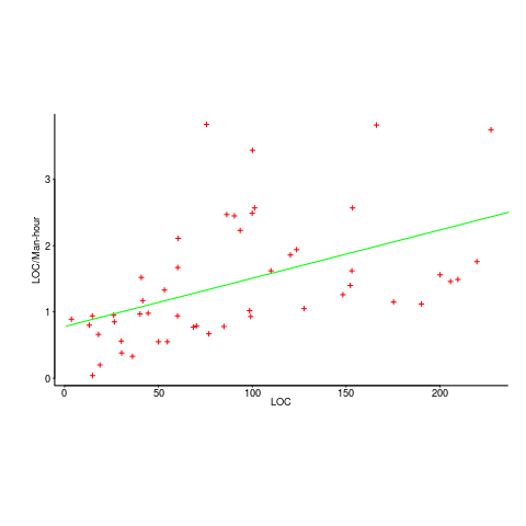
The x-axis shows LOC, and the y-axis shows LOC/man-hour. Just plotting LOC against LOC would produce a row of points along a straight line, and if we treat dividing by man-hours as roughly equivalent to dividing by a random number (which might have some correlation with LOC), the result is points scattered around a line going up to the right.
If LOC-per-hour were constant, the points would form a horizontal line across the plot.
In the below left plot, from a different report (whose axis are function-points, and function-points implemented per month), the author has fitted a line, and it is close to horizontal (suggesting that the mean FP-per-month is constant).
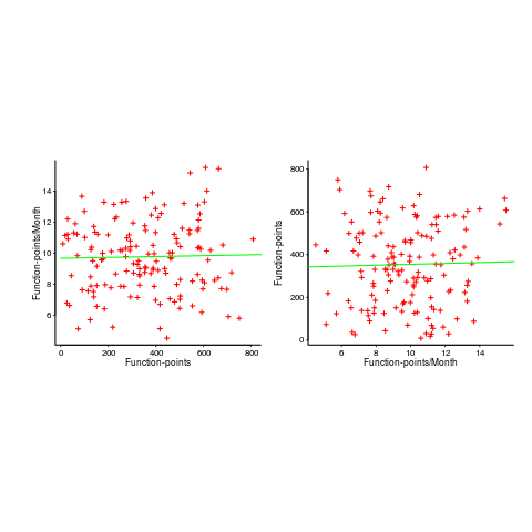
In fact the points are essentially random, and the line is a terrible fit (just how terrible is shown by switching the axis and refitting the line, above right; the refitted line should be vertical, but is horizontal. There is no connection between FP and FP-per-month, which is a good thing because the creators of function-points intended this to be true).
What process might generate this random scattering, rather than the trend seen in the first plot? If the implementation time was proportional to both the number of FP and some uniform random component, then the FP/time ratio would have the pattern seen.
The plots below show module size (in LOC) against man-hour (left) and FP against months (right):
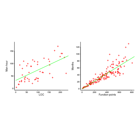
The module-LOC points are all over the place, while the FP points look as-if they are roughly consistent. Perhaps the module-LOC measurements came from a wide variety of sources, and we should not expect a visually pleasant trend.
Plotting LOC against LOC appears in other guises. Perhaps the most common being plotting fault-density against LOC; fault-density is generally calculated as faults/LOC.
Of course the artifacts also occur when plotting other kinds of measurements. Lines of code happens to be a commonly plotted quantity (at least in software engineering).