Derek Jones from The Shape of Code
A little knowledge can be a dangerous thing. For instance, knowing how to fit a regression line to a set of points, but not knowing how to figure out whether the fitted line makes any sense. Fitting a regression line is trivial, with most modern data analysis packages; it’s difficult to find data that any of them fail to fit to a straight line (even randomly selected points usually contain enough bias on one direction, to enable the fitting algorithm to converge).
Two techniques for checking the goodness-of-fit, of a regression line, are plotting confidence intervals and listing the p-value. The confidence interval approach is a great way to visualize the goodness-of-fit, with the added advantage of not needing any technical knowledge. The p-value approach is great for blinding people with science, and a necessary technicality when dealing with multidimensional data (unless you happen to have a Tardis).
In 2016, the Nationwide Mutual Insurance Company won the IEEE Computer Society/Software Engineering Institute Watts S. Humphrey Software Process Achievement (SPA) Award, and there is a technical report, which reads like an infomercial, on the benefits Nationwide achieved from using SEI’s software improvement process. Thanks to Edward Weller for the link.
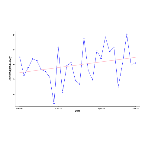
Figure 6 of the informercial technical report caught my eye. The fitted regression line shows delivered productivity going up over time, but the data looks very noisy. How good a fit is that regression line?
Thanks to WebPlotDigitizer, I quickly extracted the data (I’m a regular user, and WebPlotDigitizer just keeps getting better).
Below is the data plotted to look like Figure 6, with the fitted regression line in pink (code+data). The original did not include tick marks on the axis. For the x-axis I assumed each point was at a fixed 2-month interval (matching the axis labels), and for the y-axis I picked the point just below the zero to measure length (so my measurements may be off by a constant multiplier close to one; multiplying values by a constant will not have any influence on calculating goodness-of-fit).
The p-value for the fitted line is 0.15; gee-wiz, you say. Plotting with confidence intervals (in red; the usual 95%) makes the situation clear:
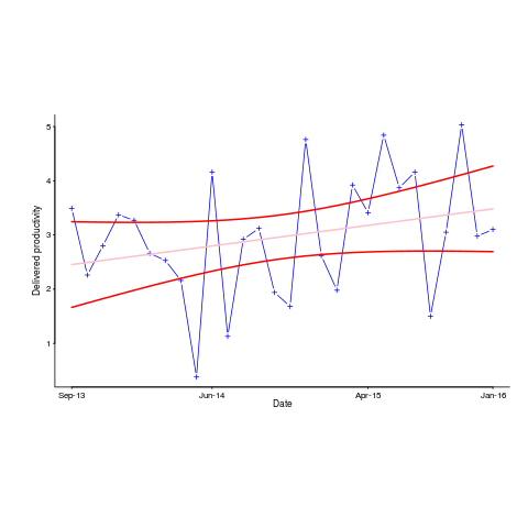
Ok, so the fitted model is fairly meaningless from a technical perspective; the line might actually go down, rather than up (there is too much noise in the data to tell). Think of the actual line likely appearing somewhere in the curved red tube.
Do Nationwide, IEEE or SEI care? The IEEE need a company to award the prize to, SEI want to promote their services, and Nationwide want to convince the rest of the world that their IT services are getting better.
Is there a company out there who feels hard done-by, because they did not receive the award? Perhaps there is, but are their numbers any better than Nationwide’s?
How much influence did the numbers in Figure 6 have on the award decision? Perhaps not a lot, the other plots look like they would tell a similar tail of wide confidence intervals on any fitted lines (readers might like to try their hand drawing confidence intervals for Figure 9). Perhaps Nationwide was the only company considered.
Who are the losers here? Other companies who decide to spend lots of money adopting the SEI software process? If evidence was available, perhaps something concrete could be figured out.