Patterns in the LSST:DM Sprint/Story-point/Story ‘done’ issues

Derek Jones from The Shape of Code

Projects that use Scrum as their project management framework estimate tasks (known as a user story, or just story) in units of Story-points. A collection of User stories are grouped together to be implemented during a Sprint (a time-boxed interval, often lasting 2-weeks).

What are Story-points, and how do they map to time (in hours and minutes)? For this post, let’s ignore these questions, simply assuming that the people who assign a story-point value to a story have some mapping in their head.

What is the average number of story-points in a story, and how does this average vary across teams? What is the distribution of number of stories estimated per sprint, how many are actually implemented, and how does this vary across teams?

The data required to answer these questions has not been publicly available, or rather public data is not known to me. Until this week, I had only known of a few public Jira repos where story-points were given for at most a few hundred stories.

The LSST Corporation, a not-for-profit involved in astronomy and physics research, has a Data Management (DM) project. The Jira repo for this project contains 26,671 ‘Done’ issues (as of Aug 2022), of which 11,082 (41.5%) have assigned story-points; there have been 469 sprints, which involved 33% of the issues. The start/end implementation date/time for stories is mostly rather granular, and not fine enough to be used to attempt to correlate individual stories with hours. I found this repo, and a couple of others, via the paper Story points changes in agile iterative development, and downloaded all available issues.

What patterns are present in the story-point and sprint data?

Story points are commonly thought of as being integer valued, but 28% of the values are non-integer. If any developers are using the Fibonacci scale, there are not enough to have a noticeable impact. The plot below shows the number of stories estimated to involve a given number of story-points (black pluses are non-integer values, which have been rounded to fit the regression model). The green curved line is a fitted biexponential (sum of two exponentials), with the two straight lines being the two component exponentials (code+data):

Number of stories estimated to involve a given number of story-points.

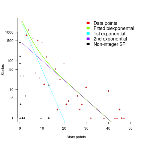
One exponential is dominant for stories assigned up to 10 story-points, and the second exponential for higher story-point values.

The development team decides to implement a story and allocates it to a sprint. A story may be reallocated to another sprint before the start of the original sprint, or after the sprint is finished when its implementation is incomplete or not yet started (the data does not allow for these cases to be distinguished). How many sprints is a story allocated to, before the story implementation is complete?

The plot below shows the number of stories allocated to a given number of sprints, with a fitted regression line of the form Stories approx Sprints^{-2.8} (code+data):

Number of stories assigned to a given number of distinct sprints.

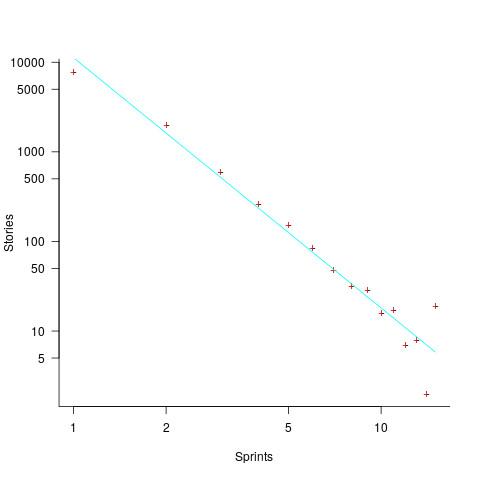
So around 14% of stories are allocated to two sprints, 5% to three and 2% to four.

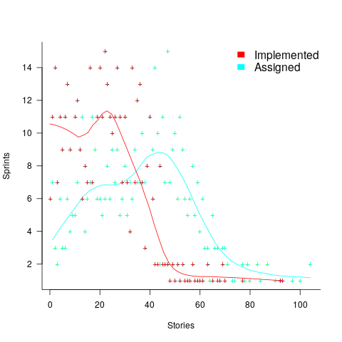
How many stories are assigned to a sprint? The plot below shows the number of sprints having a given number of stories assigned to them, and the number of sprints implementing a given number of stories; lines are fitted loess models (code+data):

Number of sprints assigned a given number of stories, and implementing a given number of stories.

Are the Story/Story-point/Sprint patterns found in the DM project likely to occur in other projects using Scrum?

I don’t know, but I hope so. Developing theories of software development processes requires that there be consistent patterns of behavior.

Not knowing what stories were assigned to a sprint at the start of the sprint, rather assigned earlier and then moved to another sprint, potentially undermines the sprint patterns. We will have to wait and see.

If anybody knows of any public Jira repos where a high percentage (say 40%) of the issues have been assigned story-points, please let me know (all the ones I know of on the Atlassian site contain a tiny percentage of story-points).

Analysis of a subset of the Linux Counter data

Derek Jones from The Shape of Code

The Linux Counter project was started in 1993, with the aim of tracking the growth of Linux users (the kernel was first released two years earlier). Anybody could register any of their machines running Linux; a user ran a script that gathered basic information about a machine, and the output was emailed to the project. Once registered, users received an annual reminder to update information in their entry (despite using Linux since before the 1.0 release, user #46406 didn’t register until 2001).

When it closed (reopened/closed/coming back) it had 120K+ registered users. That’s a lot of information about computers, which unfortunately is not publicly available. I have not had any replies to my emails to those involved, asking for a copy that could be released in anonymized form.

This week I found 15,906 rows of what looks like a subset of the Linux counter data, most entries are post-2005. What did I learn from this data?

An obvious use is the pattern to check is changes over time. While the data does not include any explicit date, it does include the Kernel version, from which the earliest date can be inferred.

An earlier post used SPEC data to estimate the growth in installed memory over time; it has been doubling every 840 days, give or take. That data contains one data point per distinct vendor computer; the Linux counter data contains one entry per computer in use. There is around thirty pairs of entries for updated systems, i.e., a user updated the entry for an existing system.

The plot below shows memory installed in each registered computer, over time, for servers, laptops and workstations, with fitted regression lines. The memory size doubling times are: servers 4,000 days, laptops 2,000 days, and workstations 1,300 days (code+data):

Memory reported for system owned by Linux counter users, from 1995 to 2015.

A regression model using dates is a good fit in the statistical sense, but explain very little of the variance in the data. The actual date on which the memory size was selected may have been earlier (because the kernel has been updated to a later release), or later (because memory was added, but the kernel was not updated).

Why is the memory doubling time so long?

Has memory size now reached the big-enough boundary, do Linux counter users keep the same system for many years without upgrading, are Linux counter systems retired Windows boxes that have been repurposed (data on installed memory Windows boxes would answer this point)?

Suggestions welcome.

When memory capacity is limited, it may be useful to swap least recently used memory contents to disc; Linux setup includes the specification of a swap partition. What is the optimal size of the size partition? A common recommendation is: if memory is less than 2G swap size is twice memory; if between 2-8G swap size is the same as memory, and for greater than 8G, half of memory size. The table below shows the percentage of particular system classes having a given swap/memory ratio (rounding the list of ratios to contain one decimal digit produces a list of over 100 ratio values).

swap/memory   Server  Workstation   Laptop 
   1.0         15.2       19.9       25.9
   2.0         10.3        9.6        8.6
   0.5          9.5        7.7        8.4

The plot below shows memory against swap partition size, for the system classes laptop, server and workstation, with fitted regression line (code+data):

Memory and swap size reported for system owned by Linux counter users.

The available disk space also has a (small) impact on swap partition size; the following model explains 46% of the variance in the data: swapSize approx memory^{0.65}diskSpace^{0.08}.

I was hoping to confirm the rate of installed memory growth suggested by the SPEC data, with installed systems lagging a few years behind the latest releases. This Linux counter data tells a very different growth story. Perhaps pre-2005 data will tell another story (I just need to find it).

I’m not sure if the swap/memory ratio analysis is of any use to systems people. It was something of a fishing expedition on my part.

Other counting projects have included the Ubuntu counter project, and Hardware for Linux which is still active and goes back to August 2014.

I’m interested in hearing about the availability of any other Linux counter data, or data from other computer counting projects.

Finding patterns in construction project drawing creation dates

Derek Jones from The Shape of Code

I took part in Projecting Success‘s 13th hackathon last Thursday and Friday, at CodeNode (host to many weekend hackathons and meetups); around 200 people turned up for the first day. Team Designing-Success included Imogen, Ryan, Dillan, Mo, Zeshan (all building construction domain experts) and yours truly (a data analysis monkey who knows nothing about construction).

One of the challenges came with lots of real multi-million pound building construction project data (two csv files containing 60K+ rows and one containing 15K+ rows), provided by SISK. The data contained information on project construction drawings and RFIs (request for information) from 97 projects.

The construction industry is years ahead of the software industry in terms of collecting data, in that lots of companies actually collect data (for some, accumulate might be a better description) rather than not collecting/accumulating data. While they have data, they don’t seem to be making good use of it (so I am told).

Nearly all the discussions I have had with domain experts about the patterns found in their data have been iterative, brief email exchanges, sometimes running over many months. In this hack, everybody involved is sitting around the same table for two days, i.e., the conversation is happening in real-time and there is a cut-off time for delivery of results.

I got the impression that my fellow team-mates were new to this kind of data analysis, which is my usual experience when discussing patterns recently found in data. My standard approach is to start highlighting visual patterns present in the data (e.g., plot foo against bar), and hope that somebody says “That’s interesting” or suggests potentially more interesting items to plot.

After several dead-end iterations (i.e., plots that failed to invoke a “that’s interesting” response), drawings created per day against project duration (as a percentage of known duration) turned out to be of great interest to the domain experts.

Building construction uses a waterfall process; all the drawings (i.e., a kind of detailed requirements) are supposed to be created at the beginning of the project.

Hmm, many individual project drawing plots were showing quite a few drawings being created close to the end of the project. How could this be? It turns out that there are lots of different reasons for creating a drawing (74 reasons in the data), and that it is to be expected that some kinds of drawings are likely to be created late in the day, e.g., specific landscaping details. The 74 reasons were mapped to three drawing categories (As built, Construction, and Design Development), then project drawings were recounted and plotted in three colors (see below).

The domain experts (i.e., everybody except me) enjoyed themselves interpreting these plots. I nodded sagely, and occasionally blew my cover by asking about an acronym that everybody in the construction obviously knew.

The project meta-data includes a measure of project performance (a value between one and five, derived from profitability and other confidential values) and type of business contract (a value between one and four). The data from the 97 projects was combined by performance and contract to give 20 aggregated plots. The evolution of the number of drawings created per day might vary by contract, and the hypothesis was that projects at different performance levels would exhibit undesirable patterns in the evolution of the number of drawings created.

The plots below contain patterns in the quantity of drawings created by percentage of project completion, that are: (left) considered a good project for contract type 1 (level 5 are best performing projects), and (right) considered a bad project for contract type 1 (level 1 is the worst performing project). Contact the domain experts for details (code+data):

Number of drawings created at percentage project completion times.

The path to the above plot is a common one: discover an interesting pattern in data, notice that something does not look right, use domain knowledge to refine the data analysis (e.g., kinds of drawing or contract), rinse and repeat.

My particular interest is using data to understand software engineering processes. How do these patterns in construction drawings compare with patterns in the software project equivalents, e.g., detailed requirements?

I am not aware of any detailed public data on requirements produced using a waterfall process. So the answer is, I don’t know; but the rationales I heard for the various kinds of drawings sound as-if they would have equivalents in the software requirements world.

What about the other data provided by the challenge sponsor?

I plotted various quantities for the RFI data, but there wasn’t any “that’s interesting” response from the domain experts. Perhaps the genius behind the plot ideas will be recognized later, or perhaps one of the domain experts will suddenly realize what patterns should be present in RFI data on high performance projects (nobody is allowed to consider the possibility that the data has no practical use). It can take time for the consequences of data analysis to sink in, or for new ideas to surface, which is why I am happy for analysis conversations to stretch out over time. Our presentation deck included some RFI plots because there was RFI data in the challenge.

What is the software equivalent of construction RFIs? Perhaps issues in a tracking system, or Jira tickets? I did not think to talk more about RFIs with the domain experts.

How did team Designing-Success do?

In most hackathons, the teams that stay the course present at the end of the hack. For these ProjectHacks, submission deadline is the following day; the judging is all done later, electronically, based on the submitted slide deck and video presentation. The end of this hack was something of an anti-climax.

Did team Designing-Success discover anything of practical use?

I think that finding patterns in the drawing data converted the domain experts from a theoretical to a practical understanding that it was possible to extract interesting patterns from construction data. They each said that they planned to attend the next hack (in about four months), and I suggested that they try to bring some of their own data.

Can these drawing creation patterns be used to help monitor project performance, as it progressed? The domain experts thought so. I suspect that the users of these patterns will be those not closely associated with a project (those close to a project are usually well aware of that fact that things are not going well).

Pomodoros worked during a day: an analysis of Alex’s data

Derek Jones from The Shape of Code

Regular readers know that I am always on the lookout for software engineering data. One search technique is to feed a ‘magic’ phrase into a search engine, this can locate data hiding in plain sight. This week the magic phrase: “record of pomodoros” returned pages discussing two collections of daily Pomodoros worked, each over a year, plus several possible collections, i.e., not explicitly stated. My email requests for data have so far returned one of the collections, kindly made available by Alex Altair, and this post discusses Alex’s data (I have not discussed the data with Alex, who I’m hoping won’t laugh too loud at the conclusions I have reached).

Before analyzing data I always make predictions about what I expect to see. I know from the email containing the data that it consisted of two columns: date and Pomodoro’s worked, i.e., no record of task names. The first two predictions for this data were the two most common patterns seen in estimation data, i.e., use of round numbers, and a weekend-effect (most people don’t work during the weekend and the autocorrelation of the daily counts contain peaks at lags of 6 and 7). The third prediction was that over time the daily total Pomodoro counts would refine into counts for each of the daily tasks (I had looked at the first few lines of the data and seen totals for the daily Pomodoros worked.

The Renzo Pomodoro dataset is my only previous experience analysing Pomodoro data. Renzo created a list of tasks for the day, estimated the number of Pomodoros for each task would take, and recorded how many it actually took. For comparison, the SiP effort estimation dataset estimates software engineering tasks in hours.

Alex uses Pomodoros as a means of focusing his attention on the work to be done, and the recorded data is a measure of daily Pomodoro work done.

I quickly discovered that all my predictions were wrong, i.e., no obvious peaks showing use of round numbers, no weekend effect, and always daily totals. Ho-hum.

The round number effect is very prominent in estimates, but is not always visible in actuals; unless people are aiming to meet targets or following Parkinson’s law.

How many days had one Pomodoro worked, how many two Pomodoro, etc? The plot below shows the number of days for which a given number of Pomodoros were worked (the number of days with zero Pomodoros is not shown); note the axis are log scaled. The blue points are for all days in 2020, and the green points are all days in 2020+178 days of 2021. The red lines are two sets of two fitted power laws (code+data):

Number of days on which a given number of Pomodoros were worked, with fitted power laws.

Why the sudden change of behavior after seven Pomodoro? Given a Pomodoro of 25-minutes (Alex says he often used this), seven of them is just under 3-hours, say half a day. Perhaps Alex works half a day, for every day of the week.

Why the change of behavior since the end of 2020 (i.e., exponent of left line changes from 0.3 to -0.1, exponent of right line is -3.0 in both cases)? Perhaps Alex is trying out another technique. The initial upward trend is consistent with the Renzo Pomodoro dataset.

The daily average Pomodoros worked is unchanged at around 5.6. The following plot shows daily Pomodoros worked over the 543 days, red line is a fitted loess model.

Daily Pomodoros worked over 543 days.

The weekend effect might not be present, but there is a strong correlation between adjacent days (code+data). The best fitting ARIMA model gives the equation: P_t=0.37+0.93*P_{t-1}+w_t-0.74*w_{t-1}, where: P_t is the Pomodoros worked on day t, P_{t-1} Pomodoros worked on the previous day, w_t is white noise (e.g., a Normal distribution) with a zero mean and a standard deviation of 4 (in this case) on day t, and w_{t-1} the previous day’s noise (see section 11.10 of my book for technical time series details).

This model is saying that the number of Pomodoros worked today is strongly influenced by yesterday’s Pomodoro worked, modulated by a large random component that could be large enough to wipe out the previous days influence. Is this likely to be news to Alex, or to anybody looking at the plot of Pomodoros over time? Probably not.

For me, the purpose of data analysis is to find patterns of behavior that are of use to those involved in the processes that generated the data (for many academics, at least in software engineering, the purpose appears to be to find patterns that can be used to publish papers, and given enough searching, it is always possible to find patterns in data). What patterns of behavior might Alex be interested in?

Does more Pomodoro work get done at the start of the week, compared to the end of the week? The following heatmap is based on the number of week days on which a given number of Pomodoros were worked. The redder the region, the more likely that value is likely to occur (code+data):

Heatmap of number of days on which a given number of Pomodoros were worked on a given day of the week.

There are certainly more days near the end of the week having little or no Pomodoro work, and the high Pomodoro work days appear to be nearer the start of the week. I need to find a statistical technique that quantifies these observations.

I think that the middle plot is the most generally useful, it illustrates how variable the work done during a day can be.

Is Alex’s Pomodoro work typical or unusual? We will have to wait for a lot more data before that question can be addressed.

If you are a Pomodoro user, and have ideas for possible patterns in the data, please let me know.

As always, pointers to more data, Pomodoro or otherwise, most welcome.

Beta release of data analysis chapters: Evidence-based software engineering

Derek Jones from The Shape of Code

When I started my evidence-based software engineering book, nobody had written a data analysis book for software developers, so I had to write one (in fact, a book on this topic has still to be written). When I say “I had to write one”, what I mean is that the 200 pages in the second half of my evidence-based software engineering book contains a concentrated form of such a book.

This 200 pages is now on beta release (it’s 186 pages, if the bibliography is excluded); chapters 8 to 15 of the draft pdf. Originally I was going to wait until all the material was ready, before making a beta release; the Coronavirus changed my plans.

Here is your chance to learn a new skill during the lockdown (yes, these are starting to end; my schedule has not changed, I’m just moving with the times).

All the code+data is available for you to try out any ideas you might have.

The software engineering material, the first half of the book, is also part of the current draft pdf, and the polished form should be available on beta release in about 6 weeks.

If you have a comment or find a problem, either email me or raise an issue on the book’s Github page.

Yes, a few figures and tables still bump into each other. I’m loath to do very fine-tuning because things will shuffle around a bit with minor changes to the words.

I’m thinking of running some online sessions around each chapter. Watch this space for information.

A study, a replication, and a rebuttal; SE research is starting to become serious

Derek Jones from The Shape of Code

tldr; A paper makes various claims based on suspect data. A replication finds serious problems with the data extraction and analysis. A rebuttal paper spins the replication issues as being nothing serious, and actually validating the original results, i.e., the rebuttal is all smoke and mirrors.

When I first saw the paper: A Large-Scale Study of Programming Languages and Code Quality in Github, the pdf almost got deleted as soon as I started scanning the paper; it uses number of reported defects as a proxy for code quality. The number of reported defects in a program depends on the number of people using the program, more users will generate more defect reports. Unfortunately data on the number of people using a program is extremely hard to come by (I only know of one study that tried to estimate number of users); studies of Java have also found that around 40% of reported faults are requests for enhancement. Most fault report data is useless for the model building purposes to which it is put.

Two things caught my eye, and I did not delete the pdf. The authors have done good work in the past, and they were using a zero-truncated negative binomial distribution; I thought I was the only person using zero-truncated negative binomial distributions to analyze software engineering data. My data analysis alter-ego was intrigued.

Spending a bit more time on the paper confirmed my original view, it’s conclusions were not believable. The authors had done a lot of work, this was no paper written over a long weekend, but lots of silly mistakes had been made.

Lots of nonsense software engineering papers get published, nothing to write home about. Everybody gets writes a nonsense paper at some point in their career, hopefully they get caught by reviewers and are not published (the statistical analysis in this paper was probably above the level familiar to most software engineering reviewers). So, move along.

At the start of this year, the paper: On the Impact of Programming Languages on Code Quality: A Reproduction Study appeared, published in TOPLAS (the first was in CACM, both journals of the ACM).

This replication paper gave a detailed analysis of the mistakes in data extraction, and the sloppy data analyse performed in the original work. Large chunks of the first study were cut to pieces (finding many more issues than I did, but not pointing out the missing usage data). Reading this paper now, in more detail, I found it a careful, well argued, solid piece of work.

This publication is an interesting event. Replications are rare in software engineering, and this is the first time I have seen a take-down (of an empirical paper) like this published in a major journal. Ok, there have been previous published disagreements, but this is machine learning nonsense.

The Papers We Love meetup group ran a mini-workshop over the summer, and Jan Vitek gave a talk on the replication work (unfortunately a problem with the AV system means the videos are not available on the Papers We Love YouTube channel). I asked Jan why they had gone to so much trouble writing up a replication, when they had plenty of other nonsense papers to choose from. His reasoning was that the conclusions from the original work were starting to be widely cited, i.e., new, incorrect, community-wide beliefs were being created. The finding from the original paper, that has been catching on, is that programs written in some languages are more/less likely to contain defects than programs written in other languages. What I think is actually being measured is number of users of the programs written in particular languages (a factor not present in the data).

Yesterday, the paper Rebuttal to Berger et al., TOPLAS 2019 appeared, along with a Medium post by two of the original authors.

The sequence: publication, replication, rebuttal is how science is supposed to work. Scientists disagree about published work and it all gets thrashed out in a series of published papers. I’m pleased to see this is starting to happen in software engineering, it shows that researchers care and are willing to spend time analyzing each others work (rather than publishing another paper on the latest trendy topic).

From time to time I had considered writing a post about the first two articles, but an independent analysis of the data meant some serious thinking, and I was not that keen (since I did not think the data went anywhere interesting).

In the academic world, reputation and citations are the currency. When one set of academics publishes a list of mistakes, errors, oversights, blunders, etc in the published work of another set of academics, both reputation and citations are on the line.

I have not read many academic rebuttals, but one recurring pattern has been a pointed literary style. The style of this Rebuttal paper is somewhat breezy and cheerful (the odd pointed phrase pops out every now and again), attempting to wave off what the authors call general agreement with some minor differences. I have had some trouble understanding how the rebuttal points discussed are related to the problems highlighted in the replication paper. The tone of the medium post is that there is nothing to see here, let’s all move on and be friends.

An academic’s work is judged by the number of citations it has received. Citations are used to help decide whether someone should be promoted, or awarded a grant. As I write this post, Google Scholar listed 234 citations to the original paper (which is a lot, most papers have one or none). The abstract of the Rebuttal paper ends with “…and our paper is eminently citable.”

The claimed “Point-by-Point Rebuttal” takes the form of nine alleged claims made by the replication authors. In four cases the Claim paragraph ends with: “Hence the results may be wrong!”, in two cases with: “Hence, FSE14 and CACM17 can’t be right.” (these are references to the original conference and journal papers, respectively), and once with: “Thus, other problems may exist!”

The rebuttal points have a tenuous connection to the major issues raised by the replication paper, and many of them are trivial issues (compared to the real issues raised).

Summary bullet points (six of them) at the start of the Rebuttal discuss issues not covered by the rebuttal points. My favourite is the objection bullet point claiming a preference, in the replication, for the use of the Bonferroni correction rather than FDR (False Discovery Rate). The original analysis failed to use either technique, when it should have used one or the other, a serious oversight; the replication is careful and does the analysis using both.

I would be very surprised if the Rebuttal paper, in its current form, gets published in any serious journal; it’s currently on a preprint server. It is not a serious piece of work.

Somebody who has only read the Rebuttal paper would take away a strong impression that the criticisms in the replication paper were trivial, and that the paper was not a serious piece of work.

What happens next? Will the ACM appoint a committee of the great and the good to decide whether the CACM article should be retracted? We are not talking about fraud or deception, but a bunch of silly mistakes that invalidate the claimed findings. Researchers are supposed to care about the integrity of published work, but will anybody be willing to invest the effort needed to get this paper retracted? The authors will not want to give up those 234, and counting, citations.

Offer of free analysis of your software engineering data

Derek Jones from The Shape of Code

Since the start of this year, I have been telling people that I willing to analyze their software engineering data for free, provided they are willing to make the data public; I also offer to anonymize the data for them, as part of the free service. Alternatively you could read this book, and do the analysis yourself.

What will you get out of me analyzing your data?

My aim is to find patterns of behavior that will be useful to you. What is useful to you? You have to be the judge of that. It is possible that I will not find anything useful, or perhaps any patterns at all; this does not happen very often. Over the last year I have found (what I think are useful) patterns in several hundred datasets, with one dataset that I am still scratching my head over it.

Data analysis is a two-way conversation. I find some patterns, and we chat about them, hopefully you will say one of them is useful, or point me in a related direction, or even a completely new direction; the process is iterative.

The requirement that an anonymized form of the data be made public is likely to significantly reduce the offers I receive.

There is another requirement that I don’t say much about: the data has to be interesting.

What makes software engineering data interesting, or at least interesting to me?

There has to be lots of it. How much is lots?

Well, that depends on the kind of data. Many kinds of measurements of source code are generally available by the truck load. Measurements relating to human involvement in software development are harder to come by, but becoming more common.

If somebody has a few thousand measurements of some development related software activity, I am very interested. However, depending on the topic, I might even be interested in a couple of dozen measurements.

Some measurements are very rare, and I would settle for as few as two measurements. For instance, multiple implementations of the same set of requirements provides information on system development variability; I was interested in five measurements of the lines of source in five distinct Pascal compilers for the same machine.

Effort estimation data used to be rare; published papers sometimes used to include a table containing the estimate/actual data, which was once gold-dust. These days I would probably only be interested if there were a few hundred estimates, but it would depend on what was being estimated.

If you have some software engineering data that you think I might be interested in, please email to tell me something about the data (and perhaps what you would like to know about it). I’m always open to a chat.

If we both agree that it’s worth looking at your data (I will ask you to confirm that you have the rights to make it public), then you send me the data and off we go.

Teaching basic data analysis to programmers: summer internship

Derek Jones from The Shape of Code

Software engineering is one of the topics in this year’s summer internships being sponsored by R-Studio. The spec says: “Data Science Training for Software Engineers – Develop course materials to teach basic data analysis to programmers using software engineering problems and data sets.”

It’s good to see interest in data analysis of software engineering data start to gain traction.

What topics might basic data analysis for programmers include? I have written about statistical techniques that I think are useful in software engineering, but I don’t think this list would be regarded as basic. Techniques that are think are basic are:

  • a picture is worth a thousand words, so obviously visualization is a major topic,
  • building regression models is good for helping to understand what is going on.

Anything else? Well, I don’t know.

An alternative approach to teaching basic data analysis is to give examples of the kind of useful things it can be used to do. Software developers are fast learners, and given the motivation have the skills needed to find and learn techniques that they think are of use. In a basic course, I would put the emphasis on motivating developers to think that data analysis can help them do a better job.

I would NOT, repeat, not, include any material on machine learning. Software engineering data sets tend to be too small to obtain reliable results from machine learning, and I don’t want to encourage clueless button pushers.

What are the desirable skills in the summer intern? I would say that being able to write readable material is the most important, with statistical knowledge ranked second; the level of software engineering knowledge is unimportant. Data analysis tends to follow the same pattern whatever the subject; so it’s important to get somebody who knows about data analysis.

A social science major is the obvious demographic for this intern (they do lots of data analysis); the last people to consider are students majoring in a computing subject.

What statistical techniques are useful for software engineering data?

Derek Jones from The Shape of Code

What statistical techniques are of general usefulness for analyzing software engineering data?

The answer depends on the kinds of data likely to be encountered, in software engineering, and the questions likely to be asked.

When I started working on a book, aiming to cover all worthwhile publicly available software engineering data, I was hoping to refer readers to a book (or two) that they ought to read to learn the appropriate techniques. Kabacoff’s “R in Action” comes closest to the book I had in mind as a basic introduction, but there was nothing covering a wider range of topics; so I ended up writing something; I found Crawley’s “The R book”, to be the best book on the subject.

My answer to the kinds of data likely to be available was to work with all the software engineering data I could get obtain (around 600 data sets to date).

What questions should be asked about the data? My selection of questions was driven by whether the data was used in the software engineering half of the book, or the statistical analysis techniques half.

The software engineering material consists of the chapters: Introduction, Human cognitive characteristics, Cognitive capitalism, Ecosystems, Projects, Reliability and Source code. The data appeared in one of these chapters if it could be used to make (what I thought was) a practical point about the topic being discussed.

Data appeared in the statistical analysis techniques chapters, if it could be used to illustrate the technique under discussion.

What happened in practice was the software engineering material was worked on for a year or two, on realizing that bespoke statistical analysis material was needed the existing data was plundered to create the necessary chapters; after this was released, work switched back to the software engineering material (using unplundered and newly acquired data), and of course the earlier chapters plundered data from the yet to be worked on chapters.

This seems to have worked surprisingly well, at least from my perspective of keeping the production line going.

Now most if the data has been analyzed, it’s time to take a global overview and where necessary shuffle things around. I may find that everything is a complete mess; we shall see.

What techniques have I found to be useful?

The number 1, most useful data analysis technique is building a regression model. The one thing I have been consistently able to do, when analyzing other people’s data, is extract more information from it than they did (unless they also built a regression model); at times it has been embarrassing.

At number 2, is bootstrapping. Many widely used techniques only give accurate answers if the data has a normal/gaussian distribution and use of these techniques can involve a lot of arm waving involving claims about the data having a good-enough gaussian-like distribution. This arm waving was necessary before computers became available, because the practical manual techniques required a gaussian distribution. Now we have computers and techniques that don’t require any particular distribution can be used, and which in some cases are more powerful techniques than those designed for manual implementation.

Sitting here, I cannot think of a number 3; there might be one.

What techniques are not generally useful? The various tests containing some combination of the names Wilcoxon, Mann and Whitney are well past their sell-by date. Searching the source of the book I see these names still appear in one or two places; this is a hangover from the early versions from many years ago (when I was following the clueless herd) and will soon be gone.

I thought that extreme value theory might apply to some data, but have only found one data-set to which it might be applied (so not generally useful).

I spent a lot of time watching out for zero-inflated data (data containing more zero values than expected by the common probability distributions). I saw four/five papers containing plots of data that looked zero-inflated and emailed the authors asking for the data (who kindly sent it to me). None of the data turned out to be zero-inflated (I’m not sure what the authors thought about being asked for data that somebody thought was zero-inflated). This does not mean that software engineering data is not zero-inflated, only that it is not common.

My zero-inflated search was motivated by the occasional appearance of zero-truncated data (data with that does not contain zero values). Zero-truncated data occurs when counting starts at one, rather than zero (I have one data-set that is 0/1 truncated; the counting starts at 2).

I was surprised that time-series did not turn out to be widely useful.

Sometimes we are all clueless button pushers, so machine learning gets a few pages. Anybody who knows what they are doing builds regression models.

I will eventually get around to counting how many times each technique is used on the data I have (watch this blog, but don’t hold your breath).

Estimating the number of distinct faults in a program

Derek Jones from The Shape of Code

In an earlier post I gave two reasons why most fault prediction research is a waste of time: 1) it ignores the usage (e.g., more heavily used software is likely to have more reported faults than rarely used software), and 2) the data in public bug repositories contains lots of noise (i.e., lots of cleaning needs to be done before any reliable analysis can done).

Around a year ago I found out about a third reason why most estimates of number of faults remaining are nonsense; not enough signal in the data. Date/time of first discovery of a distinct fault does not contain enough information to distinguish between possible exponential order models (technical details; practically all models are derived from the exponential family of probability distributions); controlling for usage and cleaning the data is not enough. Having spent a lot of time, over the years, collecting exactly this kind of information, I was very annoyed.

The information required, to have any chance of making a reliable prediction about the likely total number of distinct faults, is a count of all fault experiences, i.e., multiple instances of the same fault need to be recorded.

The correct techniques to use are based on work that dates back to Turing’s work breaking the Enigma codes; people have probably heard of Good-Turing smoothing, but the slightly later work of Good and Toulmin is applicable here. The person whose name appears on nearly all the major (and many minor) papers on population estimation theory (in ecology) is Anne Chao.

The Chao1 model (as it is generally known) is based on a count of the number of distinct faults that occur once and twice (the Chao2 model applies when presence/absence information is available from independent sites, e.g., individuals reporting problems during a code review). The estimated lower bound on the number of distinct items in a closed population is:

S_{est} ge S_{obs}+{n-1}/{n}{f^2_1}/{2f_2}

and its standard deviation is:

S_{sd-est}=sqrt{f_2 [0.25k^2 ({f_1}/{f_2} )^4+k^2 ({f_1}/{f_2} )^3+0.5k ({f_1}/{f_2} )^2 ]}

where: S_{est} is the estimated number of distinct faults, S_{obs} the observed number of distinct faults, n the total number of faults, f_1 the number of distinct faults that occurred once, f_2 the number of distinct faults that occurred twice, k={n-1}/{n}.

A later improved model, known as iChoa1, includes counts of distinct faults occurring three and four times.

Where can clean fault experience data, where the number of inputs have been controlled, be obtained? Fuzzing has become very popular during the last few years and many of the people doing this work have kept detailed data that is sometimes available for download (other times an email is required).

Kaminsky, Cecchetti and Eddington ran a very interesting fuzzing study, where they fuzzed three versions of Microsoft Office (plus various Open Source tools) and made their data available.

The faults of interest in this study were those that caused the program to crash. The plot below (code+data) shows the expected growth in the number of previously unseen faults in Microsoft Office 2003, 2007 and 2010, along with 95% confidence intervals; the x-axis is the number of faults experienced, the y-axis the number of distinct faults.

Predicted growth of unique faults experienced in Microsoft Office

The take-away point: if you are analyzing reported faults, the information needed to build models is contained in the number of times each distinct fault occurred.