Derek Jones from The Shape of Code
Agile development processes break down the work that needs to be done into a collection of tasks (which may be called stories or some other name). A task, whose implementation time may be measured in hours or a few days, is itself composed of a collection of subtasks (which may in turn be composed of subsubtasks, and so on down).
When asked to estimate the time needed to implement a task, a developer may settle on a value by adding up estimates of the effort needed to implement the subtasks thought to be involved. If this process is performed in the mind of the developer (i.e., not by writing down a list of subtask estimates), the accuracy of the result may be affected by the characteristics of cognitive arithmetic.
Humans have two cognitive systems for processing quantities, the approximate number system (which has been found to be present in the brain of many creatures), and language. Researchers studying the approximate number system often ask subjects to estimate the number of dots in an image; I recently discovered studies of number processing that used language.
In a study by Benjamin Scheibehenne, 966 shoppers at the checkout counter in a grocery shop were asked to estimate the total value of the items in their shopping basket; a subset of 421 subjects were also asked to estimate the number of items in their basket (this subset were also asked if they used a shopping list). The actual price and number of items was obtained after checkout.
There are broad similarities between shopping basket estimation and estimating task implementation time, e.g., approximate idea of number of items and their cost. Does an analysis of the shopping data suggest ideas for patterns that might be present in software task estimate data?
The left plot below shows shopper estimated total item value against actual, with fitted regression line (red) and estimate==actual (grey); the right plot shows shopper estimated number of items in their basket against actual, with fitted regression line (red) and estimate==actual (grey) (code+data):
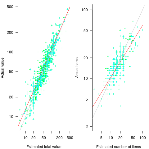
The model fitted to estimated total item value is:  , which differs from software task estimates/actuals in always underestimating over the range measured; the exponent value,
  , is at the upper range of those seen for software task estimates.
The model fitted to estimated number of items in the basket is:  . This pattern, of underestimating small values and overestimating large values is seen in software task estimation, but the exponent of
  is much smaller.
Including the estimated number of items in the shopping basket,  , in a model for total value produces a slightly better fitting model:
  , which explains 83% of the variance in the data (use of a shopping list had a relatively small impact).
The accuracy of a software task implementation estimate based on estimating its subtasks dependent on identifying all the subtasks, or having a good enough idea of the number of subtasks. The shopping basket study found a pattern of inaccuracies in estimates of the number of recently collected items, which has been seen before. However, adding to the Shopping model only reduced the unexplained variance by a few percent.
Would the impact of adding an estimate of the number of subtasks to models of software task estimates also only be a few percent? A question to add to the already long list of unknowns.
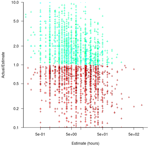
Like task estimates, round numbers were often given as estimate values; see code+data.
The same study also included a laboratory experiment, where subjects saw a sequence of 24 numbers, presented one at a time for 0.5 seconds each. At the end of the sequence, subjects were asked to type in their best estimate of the sum of the numbers seen (other studies asked subjects to type in the mean). Each subject saw 75 sequences, with feedback on the mean accuracy of their responses given after every 10 sequences. The numbers were described as the prices of items in a shopping basket. The values were drawn from a distribution that was either uniform, positively skewed, negatively skewed, unimodal, or bimodal. The sequential order of values was either increasing, decreasing, U-shaped, or inversely U-shaped.
Fitting a regression model to the lab data finds that the distribution used had very little impact on performance, and the sequence order had a small impact; see code+data.
 (an overestimate occurs when
  , an underestimate when
  )?
)?
}") , where
, where  is the number of estimated values,
  the estimates, and
  the actual values; smaller
  is better.
=(E-A)^2") , known as squared error (SE)
, known as squared error (SE)=delim{|}{E-A}{|}") , known as absolute error (AE)
, known as absolute error (AE)=delim{|}{E-A}{|}/A") , known as absolute percentage error (APE)
, known as absolute percentage error (APE)=delim{|}{E-A}{|}/E") , known as relative error (RE)
, known as relative error (RE)=delim{|}{1-(A/E)^{beta}}{|}") , with
, with  and
and  respectively.
 . When asked to implement a new task, an optimist might estimate 20% lower than the mean,
  , while a pessimist might estimate 20% higher than the mean,
  . Data shows that the distribution of the number of tasks taking a given amount of time to implement is skewed, looking something like one of the lines in the plot below (
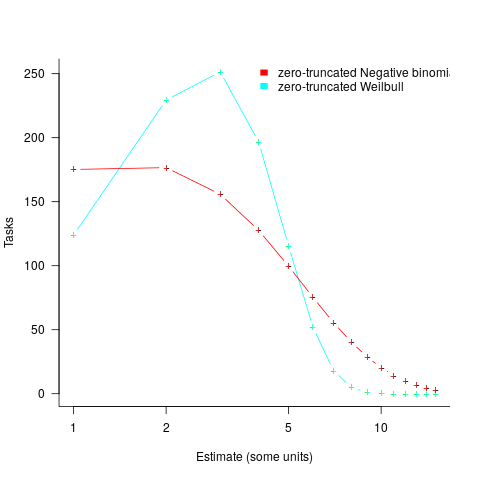
 and
and  are calculated from the mean,
  .
.") , i.e., the actual implementation time multiplied by a random value uniformly distributed between 0.5 and 2.0, i.e., Esta is an unbiased estimator. Esta’s table of multipliers is:
, i.e., the actual implementation time multiplied by a random value uniformly distributed between 0.5 and 2.0, i.e., Esta is an unbiased estimator. Esta’s table of multipliers is: in this general form creates a scoring function that produces a multiplication factor of 1 for the Negative binomial case.
 (
(
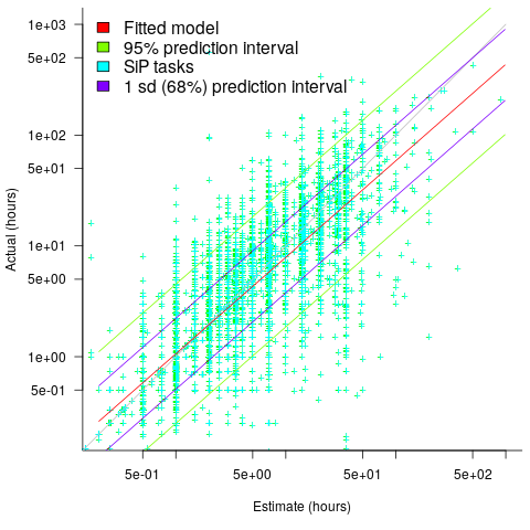
 explains nearly all the variance present in the data.
 ; the y-axis uses a log scale so that under/over estimates appear symmetrical (
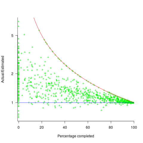
 , and
, and  .
. (plotted in red). The top of the ‘cone’ does not represent managements’ increasing certainty, with project progress, it represents the mathematical upper bound on the possible inaccuracy of an estimate.

 , and
, and  .
. (plotted in red). The top of the ‘cone’ does not represent managements’ increasing certainty, with project progress, it represents the mathematical upper bound on the possible inaccuracy of an estimate.
 , where:
  is a constant and
  is the number of days since the start of the interval fitted. The second (middle) black line is a fitted straight line.