Over/under estimation factor for ‘most estimates’

Derek Jones from The Shape of Code

When asked to estimate the time taken to perform a software development related task, people regularly over or under estimate. What range of over/under estimation falls within the bounds of the term ‘most estimates’, i.e., the upper/lower bounds of the ratio Actual/Estimate (an overestimate occurs when Actual/Estimate < 1, an underestimate when 1 < Actual/Estimate)?

On Twitter, I have been citing a factor of two for over/under time estimates. This factor of two involves some assumptions and a personal interpretation.

The following analysis is based on the two major software task effort estimation datasets: SiP and CESAW. The tasks in both datasets are for internal projects (i.e., no tendering against competitors), and require at most a few hours work.

The following analysis is based on the SiP data.

Of the 8,252 unique tasks in the SiP data, 30% are underestimates, 37% exact, and 33% overestimates.

How do we go about calculating bounds for the over/under factor of most estimates (a previous post discussed calculating an accuracy metric over all estimates)?

A simplistic approach is to average over each of the overestimated and underestimated tasks. The plot below shows hours estimated against the ratio actual/estimated, for each task (code+data):

Actual/estimate ratio for SiP tasks having a given Estimate value.

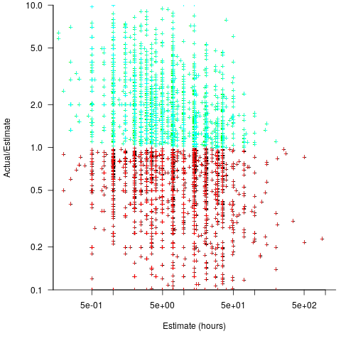
Averaging the over/under estimated tasks separately (using the geometric mean) gives 0.47 and 1.9 respectively, i.e., tasks are over/under estimated by a factor of two.

This approach fails to take into account the number of estimates that are over/under/equal, i.e., it ignores likelihood information.

A regression model takes into account the distribution of values, and we could adopt the fitted model’s prediction interval as the over/under confidence intervals. The prediction interval is the interval within which other observations are expected to fall, with some probability (R’s predict function uses one standard deviation).

The plot below shows a fitted regression model and prediction intervals at one standard deviation (68.3%) and two standard deviations (95%); the faint grey line shows Estimate == Actual (code+data):

Fitted regression model and prediction intervals at 68.3% and 95%.

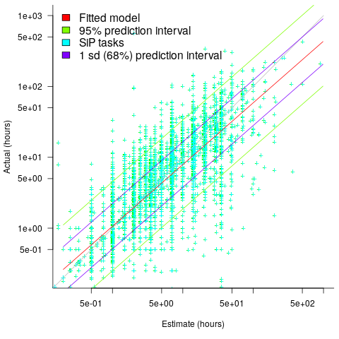
The fitted model tilts down from the upward direction of the Estimate == Actual line, consequently the over/under estimation factor depends on the size of the estimate. The table below lists the over/under estimation factor for low/high estimates at one & two standard deviations (68.3 and 95% probability).

People like simple answers (i.e., single values) and the mean value is a commonly used technique of summarising many values. The task estimate values are unevenly distributed and weighting the mean by the distribution of estimated values is more representative than, say, an evenly distributed set of estimates. The 5th and 6th columns in the table below list the weighted means at one/two standard deviations (the CESAW columns are the values for all projects in the CESAW data).

          1 sd           2 sd        Weighted mean       CESAW
       Low    High   Low    High     1 sd    2 sd     1 sd   2 sd
Over   0.56   0.24   0.27   0.11     0.46    0.25     0.29   0.1
Under  2.4    1.0    4.9    2.0      2.00    4.1      2.4    6.5

The weighted means for over/under estimates are close to a factor of two of the actual (divide/multiply) within one standard deviation (68.3%), and a factor of four within two standard deviations (95%).

Why choose to give the one standard deviation factor, rather than the two? People talk of “most estimates”, but what percentage range does ‘most’ map to? I have tended to think of ‘most’ as more than two-thirds, e.g., at least one standard deviation (a recent study suggests that ‘most’ usage peaks at 80-85%), and I think of two standard deviations as ‘nearly all’ (i.e., 95%; there are probably people who call this ‘most’).

Perhaps a between two and four is a more appropriate answer (particularly since the bounds are wider for the CESAW data). Suggestions welcome.

Regression line fitted to nosy data? Ask to see confidence intervals

Derek Jones from The Shape of Code

A little knowledge can be a dangerous thing. For instance, knowing how to fit a regression line to a set of points, but not knowing how to figure out whether the fitted line makes any sense. Fitting a regression line is trivial, with most modern data analysis packages; it’s difficult to find data that any of them fail to fit to a straight line (even randomly selected points usually contain enough bias on one direction, to enable the fitting algorithm to converge).

Two techniques for checking the goodness-of-fit, of a regression line, are plotting confidence intervals and listing the p-value. The confidence interval approach is a great way to visualize the goodness-of-fit, with the added advantage of not needing any technical knowledge. The p-value approach is great for blinding people with science, and a necessary technicality when dealing with multidimensional data (unless you happen to have a Tardis).

In 2016, the Nationwide Mutual Insurance Company won the IEEE Computer Society/Software Engineering Institute Watts S. Humphrey Software Process Achievement (SPA) Award, and there is a technical report, which reads like an infomercial, on the benefits Nationwide achieved from using SEI’s software improvement process. Thanks to Edward Weller for the link.

Figure 6 of the informercial technical report caught my eye. The fitted regression line shows delivered productivity going up over time, but the data looks very noisy. How good a fit is that regression line?

Thanks to WebPlotDigitizer, I quickly extracted the data (I’m a regular user, and WebPlotDigitizer just keeps getting better).

Below is the data plotted to look like Figure 6, with the fitted regression line in pink (code+data). The original did not include tick marks on the axis. For the x-axis I assumed each point was at a fixed 2-month interval (matching the axis labels), and for the y-axis I picked the point just below the zero to measure length (so my measurements may be off by a constant multiplier close to one; multiplying values by a constant will not have any influence on calculating goodness-of-fit).

Nationwide: delivery productivity over time; extracted data and fitted regression line.

The p-value for the fitted line is 0.15; gee-wiz, you say. Plotting with confidence intervals (in red; the usual 95%) makes the situation clear:

Nationwide: delivery productivity over time; extracted data and fitted regression line with 5% confidence intervals.

Ok, so the fitted model is fairly meaningless from a technical perspective; the line might actually go down, rather than up (there is too much noise in the data to tell). Think of the actual line likely appearing somewhere in the curved red tube.

Do Nationwide, IEEE or SEI care? The IEEE need a company to award the prize to, SEI want to promote their services, and Nationwide want to convince the rest of the world that their IT services are getting better.

Is there a company out there who feels hard done-by, because they did not receive the award? Perhaps there is, but are their numbers any better than Nationwide’s?

How much influence did the numbers in Figure 6 have on the award decision? Perhaps not a lot, the other plots look like they would tell a similar tail of wide confidence intervals on any fitted lines (readers might like to try their hand drawing confidence intervals for Figure 9). Perhaps Nationwide was the only company considered.

Who are the losers here? Other companies who decide to spend lots of money adopting the SEI software process? If evidence was available, perhaps something concrete could be figured out.