Derek Jones from The Shape of Code
Project are estimated using a variety of resources. For those working at the sharp end, time is the pervasive resource. From the business perspective, the primary resource focus is on money; spending money to develop software that will make/save money.
Cost estimation data is much rarer than time estimation data (which itself is very thin on the ground).
The paper “An empirical study on a single company’s cost estimations of 338 software projects” (no public pdf currently available) by Christian Schürhoff, Stefan Hanenberg (who kindly sent me a copy of the data), and Volker Gruhn immediately caught my attention. What I am calling the Adesso dataset contains 4,713 rows relating to 338 fixed-price software projects implemented by Adesso SE (a German software and consulting company) between 2011 and the middle of 2016.
Cost estimation data is so very rare because of its commercial sensitivity. This paper deals with the commercial sensitivity issue by not releasing actual cost data, but by releasing data on a ratio of costs; the Cost Performance Index (CPI):

where:  are the actual costs (i.e., money spent) up to the current time, and
  is the earned value (a marketing term for the costs estimated for the planned work that has actually been completed up to the current time).
if  , then more was spent than estimated (i.e., project is behind schedule or was underestimated), while if
  , then less was spent than estimated (i.e., project is ahead of schedule or was overestimated).
The progress of a project’s implementation, in monetary terms, can be tracked by regularly measuring its CPI.
The Adesso dataset lists final values for each project (number of days being the most interesting), and each project’s CPI at various percent completed points. The plot below shows the number of CPI estimates for each project, against project duration; the assigned project numbers clustered into four bands and four colors are used to show projects in each band (code+data):
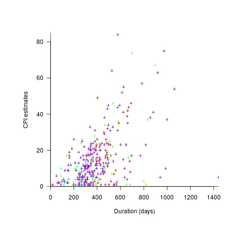
Presumably, projects that made only a handful of CPI estimates used other metrics to monitor project progress.
What are the patterns of change in a project’s CPI during its implementation? The plot below shows every CPI for each of 15 projects, with at least 44 CPI estimates, during implementation (code+data):
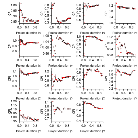
A commonly occurring theme, that will be familiar to those who have worked on projects, is that large changes usually occur at the start of the project, and then things settle down.
To continue as a going concern, a commercial company needs to make a profit. Underestimating a project may result in its implementation losing money. Losing money on some projects is not a problem, provided that the loses are cancelled out by overestimated projects making more money than planned.
While the mean CPI for the Adesso projects is 1.02 (standard deviation of 0.3), projects vary in size (and therefore costs). The data does not include project man-hours, but it does include project duration. The weighted mean, using duration as a proxy for man-hours, is 0.96 (standard deviation 0.3).
Companies cannot have long sequences of underestimated projects, creditors and shareholders will eventually call a halt. The Adesso dataset does not include any date information, so it is not possible to estimate the average CPI over shorter durations, e.g., one year.
I don’t have any practical experience of tracking project progress using earned value or CPI, and have only read theory papers on the subject (many essentially say that earned value is a great metric and everybody ought to be using it). Tips and suggestions welcome.
 ; the y-axis uses a log scale so that under/over estimates appear symmetrical (
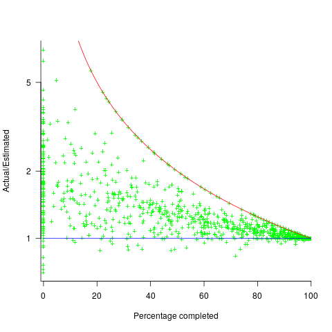
 , and
, and  .
. (plotted in red). The top of the ‘cone’ does not represent managements’ increasing certainty, with project progress, it represents the mathematical upper bound on the possible inaccuracy of an estimate.
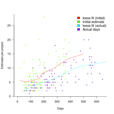
 ; the y-axis uses a log scale so that under/over estimates appear symmetrical (
 , and
, and  .
. (plotted in red). The top of the ‘cone’ does not represent managements’ increasing certainty, with project progress, it represents the mathematical upper bound on the possible inaccuracy of an estimate.