Task backlog waiting times are power laws

Derek Jones from The Shape of Code

Once it has been agreed to implement new functionality, how long do the associated tasks have to wait in the to-do queue?

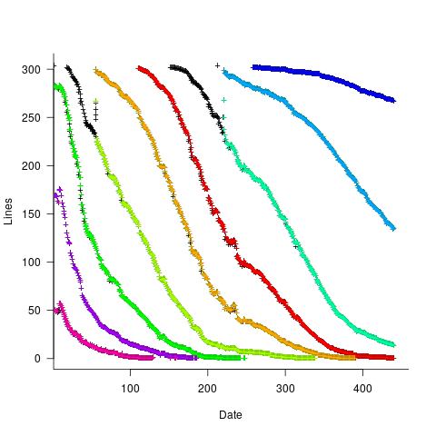
An analysis of the SiP task data finds that waiting time has a power law distribution, i.e., numTasks approx waitingTime^{-1}, where numTasks is the number of tasks waiting a given amount of time; the LSST:DM Sprint/Story-point/Story has the same distribution. Is this a coincidence, or does task waiting time always have this form?

Queueing theory analyses the properties of systems involving the arrival of tasks, one or more queues, and limited implementation resources.

A basic result of queueing theory is that task waiting time has an exponential distribution, i.e., not a power law. What software task implementation behavior is sufficiently different from basic queueing theory to cause its waiting time to have a power law?

As always, my first line of attack was to find data from other domains, hopefully with an accompanying analysis modelling the behavior. It’s possible that my two samples are just way outside the norm.

Eventually I found an analysis of the letter writing response time of Darwin, Einstein and Freud (my email asking for the data has not yet received a reply). Somebody writes to a famous scientist (the scientist has to be famous enough for people to want to create a collection of their papers and letters), the scientist decides to add this letter to the pile (i.e., queue) of letters to reply to, eventually a reply is written. What is the distribution of waiting times for replies? Yes, it’s a power law, but with an exponent of -1.5, rather than -1.

The change made to the basic queueing model is to assign priorities to tasks, and then choose the task with the highest priority (rather than a random task, or the one that has been waiting the longest). Provided the queue never becomes empty (i.e., there are always waiting tasks), the waiting time is a power law with exponent -1.5; this behavior is independent of queue length and distribution of priorities (simulations confirm this behavior).

However, the exponent for my software data, and other data, is not -1.5, it is -1. A 2008 paper by Albert-László Barabási ( detailed analysis)showed how a modification to the task selection process produces the desired exponent of -1. Each of the tasks currently in the queue is assigned a probability of selection, this probability is proportional to the priority of the corresponding task (i.e., the sum of the priorities/probabilities of all the tasks in the queue is assumed to be constant); task selection is weighted by this probability.

So we have a queueing model whose task waiting time is a power law with an exponent of -1. How well does this model map to software task selection behavior?

One apparent difference between the queueing model and waiting software tasks is that software tasks are assigned to a small number of priorities (e.g., Critical, Major, Minor), while each task in the model queue has a unique priority (otherwise a tie-break rule would have to be specified). In practice, I think that the developers involved do assign unique priorities to tasks.

Why wouldn’t a developer simply select what they consider to be the highest priority task to work on next?

Perhaps each developer does select what they consider to be the highest priority task, but different developers have different opinions about which task has the highest priority. The priority assigned to a task by different developers will have some probability distribution. If task priority assignment by developers is correlated, then the behavior is effectively the same as the queueing model, i.e., the probability component is supplied by different developers having different opinions and the correlation provides a clustering of priorities assigned to each task (i.e., not a uniform distribution).

If this mapping is correct, the task waiting time for a system implemented by one developer should have a power law exponent of -1.5, just like letter writing data.

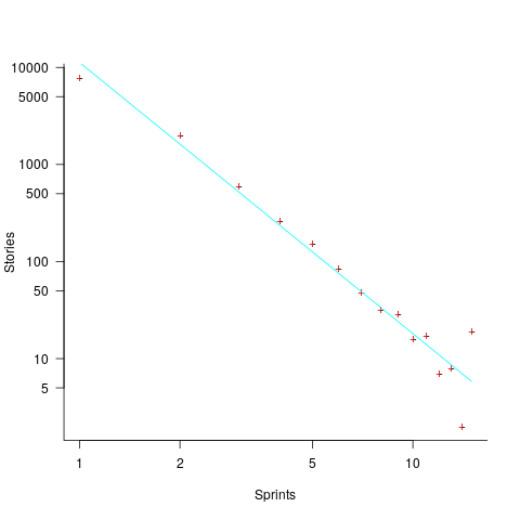
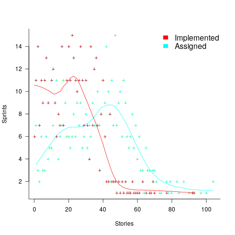
The number of sprints that a story is assigned to, before being completely implemented, is a power law whose exponent varies around -3. An explanation of this behavior based on priority queues looks possible; we shall see…

The queueing models discussed above are a subset of the field known as bursty dynamics; see the review paper Bursty Human Dynamics for human behavior related aspects.

Patterns in the LSST:DM Sprint/Story-point/Story ‘done’ issues

Derek Jones from The Shape of Code

Projects that use Scrum as their project management framework estimate tasks (known as a user story, or just story) in units of Story-points. A collection of User stories are grouped together to be implemented during a Sprint (a time-boxed interval, often lasting 2-weeks).

What are Story-points, and how do they map to time (in hours and minutes)? For this post, let’s ignore these questions, simply assuming that the people who assign a story-point value to a story have some mapping in their head.

What is the average number of story-points in a story, and how does this average vary across teams? What is the distribution of number of stories estimated per sprint, how many are actually implemented, and how does this vary across teams?

The data required to answer these questions has not been publicly available, or rather public data is not known to me. Until this week, I had only known of a few public Jira repos where story-points were given for at most a few hundred stories.

The LSST Corporation, a not-for-profit involved in astronomy and physics research, has a Data Management (DM) project. The Jira repo for this project contains 26,671 ‘Done’ issues (as of Aug 2022), of which 11,082 (41.5%) have assigned story-points; there have been 469 sprints, which involved 33% of the issues. The start/end implementation date/time for stories is mostly rather granular, and not fine enough to be used to attempt to correlate individual stories with hours. I found this repo, and a couple of others, via the paper Story points changes in agile iterative development, and downloaded all available issues.

What patterns are present in the story-point and sprint data?

Story points are commonly thought of as being integer valued, but 28% of the values are non-integer. If any developers are using the Fibonacci scale, there are not enough to have a noticeable impact. The plot below shows the number of stories estimated to involve a given number of story-points (black pluses are non-integer values, which have been rounded to fit the regression model). The green curved line is a fitted biexponential (sum of two exponentials), with the two straight lines being the two component exponentials (code+data):

Number of stories estimated to involve a given number of story-points.

One exponential is dominant for stories assigned up to 10 story-points, and the second exponential for higher story-point values.

The development team decides to implement a story and allocates it to a sprint. A story may be reallocated to another sprint before the start of the original sprint, or after the sprint is finished when its implementation is incomplete or not yet started (the data does not allow for these cases to be distinguished). How many sprints is a story allocated to, before the story implementation is complete?

The plot below shows the number of stories allocated to a given number of sprints, with a fitted regression line of the form Stories approx Sprints^{-2.8} (code+data):

Number of stories assigned to a given number of distinct sprints.

So around 14% of stories are allocated to two sprints, 5% to three and 2% to four.

How many stories are assigned to a sprint? The plot below shows the number of sprints having a given number of stories assigned to them, and the number of sprints implementing a given number of stories; lines are fitted loess models (code+data):

Number of sprints assigned a given number of stories, and implementing a given number of stories.

Are the Story/Story-point/Sprint patterns found in the DM project likely to occur in other projects using Scrum?

I don’t know, but I hope so. Developing theories of software development processes requires that there be consistent patterns of behavior.

Not knowing what stories were assigned to a sprint at the start of the sprint, rather assigned earlier and then moved to another sprint, potentially undermines the sprint patterns. We will have to wait and see.

If anybody knows of any public Jira repos where a high percentage (say 40%) of the issues have been assigned story-points, please let me know (all the ones I know of on the Atlassian site contain a tiny percentage of story-points).

Impact of number of files on number of review comments

Derek Jones from The Shape of Code

Code review is often discussed from the perspective of changes to a single file. In practice, code review often involves multiple files (or at least pull-based reviews do), which begs the question: Do people invest less effort reviewing files appearing later?

TLDR: The number of review comments decreases for successive files in the pull request; by around 16% per file.

The paper First Come First Served: The Impact of File Position on Code Review extracted and analysed 219,476 pull requests from 138 Java projects on Github. They also ran an experiment which asked subjects to review two files, each containing a seeded coding mistake. The paper is relatively short and omits a lot of details; I’m guessing this is due to the page limit of a conference paper.

The plot below shows the number of pull requests containing a given number of files. The colored lines indicate the total number of code review comments associated with a given pull request, with the red dots showing the 69% of pull requests that did not receive any review comments (code+data):

Number of pull requests containing a given number of files, for all pull requests, and those receiving at least 1, 2, 5, and 10 comments.

Many factors could influence the number of comments associated with a pull request; for instance, the number of people commenting, the amount of changed code, whether the code is a test case, and the number of files already reviewed (all items which happen to be present in the available data).

One factor for which information is not present in the data is social loafing, where people exert less effort when they are part of a larger group; or at least I did not find a way of easily estimating this factor.

The best model I could fit to all pull requests containing less than 10 files, and having a total of at least one comment, explained 36% of the variance present, which is not great, but something to talk about. There was a 16% decline in comments for successive files reviewed, test cases had 50% fewer comments, and there was some percentage increase with lines added; number of comments increased by a factor of 2.4 per additional commenter (is this due to importance of the file being reviewed, with importance being a metric not present in the data).

The model does not include information available in the data, such as file contents (e.g., Java, C++, configuration file, etc), and there may be correlated effects I have not taken into account. Consequently, I view the model as a rough guide.

Is the impact of file order on number of comments a side effect of some unrelated process? One way of showing a causal connection is to run an experiment.

The experiment run by the authors involved two files, each containing one seeded coding mistake. The 102 subjects were asked to review the two files, with file order randomly selected. The experiment looks well-structured and thought through (many are not), but the analysis of the results is confused.

The good news is that the seeded coding mistake in the first file was much more likely to be detected than the mistake in the second file, and years of Java programming experience also had an impact (appearing first had the same impact as three years of Java experience). The bad news is that the model (a random effect model using a logistic equation) explains almost none of the variance in the data, i.e., these effects are tiny compared to whatever other factors are involved; see code+data.

What other factors might be involved?

Most experiments show a learning effect, in that subject performance improves as they perform more tasks. Having subjects review many pairs of files would enable this effect to be taken into account. Also, reviewing multiple pairs would reduce the impact of random goings-on during the review process.

The identity of the seeded mistake did not have a significant impact on the model.

Review comments are an important issue which is amenable to practical experimental investigation. I hope that the researchers run more experiments on this issue.

Analysis of a subset of the Linux Counter data

Derek Jones from The Shape of Code

The Linux Counter project was started in 1993, with the aim of tracking the growth of Linux users (the kernel was first released two years earlier). Anybody could register any of their machines running Linux; a user ran a script that gathered basic information about a machine, and the output was emailed to the project. Once registered, users received an annual reminder to update information in their entry (despite using Linux since before the 1.0 release, user #46406 didn’t register until 2001).

When it closed (reopened/closed/coming back) it had 120K+ registered users. That’s a lot of information about computers, which unfortunately is not publicly available. I have not had any replies to my emails to those involved, asking for a copy that could be released in anonymized form.

This week I found 15,906 rows of what looks like a subset of the Linux counter data, most entries are post-2005. What did I learn from this data?

An obvious use is the pattern to check is changes over time. While the data does not include any explicit date, it does include the Kernel version, from which the earliest date can be inferred.

An earlier post used SPEC data to estimate the growth in installed memory over time; it has been doubling every 840 days, give or take. That data contains one data point per distinct vendor computer; the Linux counter data contains one entry per computer in use. There is around thirty pairs of entries for updated systems, i.e., a user updated the entry for an existing system.

The plot below shows memory installed in each registered computer, over time, for servers, laptops and workstations, with fitted regression lines. The memory size doubling times are: servers 4,000 days, laptops 2,000 days, and workstations 1,300 days (code+data):

Memory reported for system owned by Linux counter users, from 1995 to 2015.

A regression model using dates is a good fit in the statistical sense, but explain very little of the variance in the data. The actual date on which the memory size was selected may have been earlier (because the kernel has been updated to a later release), or later (because memory was added, but the kernel was not updated).

Why is the memory doubling time so long?

Has memory size now reached the big-enough boundary, do Linux counter users keep the same system for many years without upgrading, are Linux counter systems retired Windows boxes that have been repurposed (data on installed memory Windows boxes would answer this point)?

Suggestions welcome.

When memory capacity is limited, it may be useful to swap least recently used memory contents to disc; Linux setup includes the specification of a swap partition. What is the optimal size of the size partition? A common recommendation is: if memory is less than 2G swap size is twice memory; if between 2-8G swap size is the same as memory, and for greater than 8G, half of memory size. The table below shows the percentage of particular system classes having a given swap/memory ratio (rounding the list of ratios to contain one decimal digit produces a list of over 100 ratio values).

swap/memory   Server  Workstation   Laptop 
   1.0         15.2       19.9       25.9
   2.0         10.3        9.6        8.6
   0.5          9.5        7.7        8.4

The plot below shows memory against swap partition size, for the system classes laptop, server and workstation, with fitted regression line (code+data):

Memory and swap size reported for system owned by Linux counter users.

The available disk space also has a (small) impact on swap partition size; the following model explains 46% of the variance in the data: swapSize approx memory^{0.65}diskSpace^{0.08}.

I was hoping to confirm the rate of installed memory growth suggested by the SPEC data, with installed systems lagging a few years behind the latest releases. This Linux counter data tells a very different growth story. Perhaps pre-2005 data will tell another story (I just need to find it).

I’m not sure if the swap/memory ratio analysis is of any use to systems people. It was something of a fishing expedition on my part.

Other counting projects have included the Ubuntu counter project, and Hardware for Linux which is still active and goes back to August 2014.

I’m interested in hearing about the availability of any other Linux counter data, or data from other computer counting projects.

Estimation accuracy in the (building|road) construction industry

Derek Jones from The Shape of Code

Lots of people complain about software development taking longer than estimated. Are estimates in other industries more accurate, and do they contain patterns similar to those seen in software task estimates?

Readers will probably not be surprised to learn that obtaining estimate/actual data is as hard for other industries as it is for software.

Software engineering sometimes gets compared with building construction, in the sense that building construction is perceived as being straightforward and predictable. My tiny experience with building construction is that it is not as straightforward and predictable as outsiders think, a view echoed by the few people in the building industry I have spoken to.

I have found two building datasets, the supplementary material from: Forecasting the Project Duration Average and Standard Deviation from Deterministic Schedule Information (the 101 rows also include some service projects), and Ballesteros-Pérez kindly sent me the data for Duration and Cost Variability of Construction Activities: An Empirical Study which included 746 rows of road construction estimate/actual data from an unknown source. This data is for large projects, where those involved had to bid to get the work.

The following plot reminds us of how effort vs actual often looks like for short software tasks; it includes a fitted regression model and prediction intervals at one standard deviation (68.3%) and two standard deviations (95%); the faint grey line shows Estimate == Actual (post discussing the analysis and linking to code+data):

Fitted regression model and prediction intervals at 68.3% and 95%.

The data in the above plot is for small tasks, which did not involve bidding for the work.

The following plot shows estimated vs actual duration for 101 construction projects. The red line has the form: Actual=1.09*Estimate
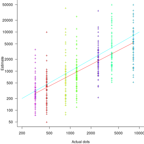
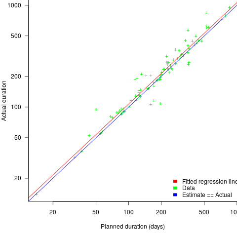
, i.e., average estimate is 9% lower than actual duration (blue line shows Actual=Estimate; code+data).

Planned and actual duration of 101 building construction projects, with fitted regression (red) and estimate==actual (blue).

The obvious differences are that the fitted line shows consistent underestimation (hardly surprising when bidding for work; 16% of estimates are greater than the actual), that the variance of project estimate/actual about the line is much smaller for building construction, and that the red/blue lines are essentially parallel (the exponent for software tasks is consistently around 0.85, rather than 1)

The following plot shows estimated vs actual for 746 road construction projects. The red line has the form: Actual=1.24*Estimate, i.e., average estimate is 24% lower than actual duration (blue line shows
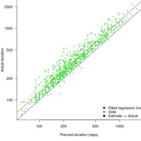
 Actual=Estimate; code+data):

Planned and actual duration of 746 road construction projects, with fitted regression (red) and estimate==actual (blue).

Again there is a consistent average underestimate (project bidding was via an auction process), the red/blue lines are essentially parallel, and while the estimate/actual variance is larger than for building construction only 1.5% estimates are greater than the actual.

Consistent underestimating is not surprising for external projects awarded via a bidding process.

The unpredicted differences are the much smaller estimate/actual variance (compared to software), and the fitted line running parallel to Actual=Estimate.

Evolution of the DORA metrics

Derek Jones from The Shape of Code

There is a growing buzz around the DORA metrics. Where did the DORA metrics come from, what are they, and are they useful?

The company DevOps Research and Assessment LLC (DORA) was founded by Nicole Forsgren, Jez Humble, and Gene Kim in 2016, and acquired by Google in 2018. DevOps is a role that combines software development (Dev) and IT operations (Ops).

The original ideas behind the DORA metrics are described in the 2015 paper DevOps: Profiles in ITSM Performance and Contributing Factors, by Forsgren and Humble. The more well known Accelerate book, published in 2018, is an evangelistic reworking of the material, plus some business platitudes extolling the benefits of using a lean process.

The 2015 paper approaches the metric selection process from the perspective of reducing business costs, and uses a data driven approach. This is how metric selection should be done, and for the first seven or eight pages I was cheering the authors on. The validity of a data driven approaches depends on the reliability of the data and its applicability to the questions being addressed. I don’t think that the reliability of the data used is sufficient to support the conclusions being drawn from it. The data used is the survey results behind the Puppet Labs 2015 State of DevOps Report; the 2018 book included data from the 2016 and 2017 State of DevOps reports.

Between 2015-2018, DORA is more a way of doing DevOps than a collection of metrics to calculate. The theory is based on ideas from the Economic Order Quantity model; this model is used in inventory management to calculate the number of items that should be held in stock, to meet production demand, such that stock holding costs plus item reordering costs are minimised (when the number of items in stock falls below some value, there is an optimum number of items to reorder to replenish stocks).

The DORA mapping of the Economic Order Quantity model to DevOps employs a rather liberal interpretation of the concepts involved. There are three fundamental variables:

  • Batch size: the quantity of additions, modifications and deletions of anything that could have an effect on IT services, e.g., changes to code or configuration files,
  • Holding cost: the lost opportunity cost of not deploying work that has been done, e.g., lost business because a feature is not available or waste because an efficiency improvement is not used. Cognitive capitalism also has the lost opportunity cost of not learning about the impact of an update on the ecosystem,
  • Transaction cost: the cost of building, testing and deploying to production a completed batch.

The aim is to minimise TotalCost=HoldingCost+TransationCost.

So far, so good and reasonable.

Now the details; how do we measure batch size, holding cost and transaction cost?

DORA does not measure these quantities (the paper points out that deployment frequency could be treated as a proxy for batch size, in that as deployment frequency goes to infinity batch size goes to zero). The terms holding cost and transaction cost do not appear in the 2018 book.

Having mapped Economic Order Quantity variables to software, the 2015 paper pivots and maps these variables to a Lean manufacturing process (the 2018 book focuses on Lean). Batch size is now deployment frequency, and higher is better.

Ok, let’s follow the pivoted analysis of Lean ideas applied to software. The 2015 paper uses cluster analysis to find patterns in the 2015 State of DevOps survey data. I have not seen any of the data, or even the questions asked; the description of the analysis is rather sketchy (I imagine it is similar to that used by Forsgren in her PhD thesis on a different dataset). The report published by Puppet Labs analyses the data using linear regression and partial least squares.

Three IT performance profiles are characterized (High, Medium and Low). Why three and not, say, four or five? The papers simply says that three ’emerged’.

The analysis of the Puppet Labs 2015 survey data (6k+ responses) essentially takes the form of listing differences in values of various characteristics between High/Medium/Low teams; responses came from “technical professionals of all specialities involved in DevOps”. The analysis in the 2018 book discussed some of the between year differences.

My experience of asking hundreds of people for data is that most don’t have any. I suspect this is true of those who answered the Puppet Labs surveys, and that answers are guestimates.

The fact that the accuracy of analysis of the survey data is poor does not really matter, because DORA pivots again.

This pivot switches to organizational metrics (from team metrics), becomes purely production focused (very appropriate for DevOps), introduces an Elite profile, and focuses on four key metrics; the following is adapted from Google:

  • Deployment Frequency: How often an organization successfully releases to production,
  • Lead Time for Changes: The amount of time it takes a commit to get into production,
  • Change Failure Rate: The percentage of deployments causing a failure in production,
  • Mean time to repair (MTTR): How long it takes an organization to recover from a failure in production.

Are these four metrics useful?

To somebody with zero DevOps experience (i.e., me) they look useful. The few DevOps people I have spoken to are talking about them but not using them (not least because they don’t have the data required).

The characteristics of the Elite/High/Medium/Low profiles reflects Google’s DevOps business interests. Companies offering an online service at a national scale want to quickly respond to customer demand, continuously deploy, and quickly recover from service outages.

There are companies where it makes business sense for DevOps deployments to occur much less frequently than at Google. I also know companies who would love to have deployment rates within an order of magnitude of Google’s, but cannot even get close without a significant restructuring of their build and deployment infrastructure.

Extracting numbers from a stacked density plot

Derek Jones from The Shape of Code

A month or so ago, I found a graph showing a percentage of PCs having a given range of memory installed, between March 2000 and April 2020, on a TechTalk page of PC Matic; it had the form of a stacked density plot. This kind of installed memory data is rare, how could I get the underlying values (a previous post covers extracting data from a heatmap)?

The plot below is the image on PC Matic’s site:

Percentage of PC having a given amount of installed memory, from 2000 to 2020.

The change of colors creates a distinct boundary between different memory capacity ranges, and it ought to be possible to find the y-axis location of each color change, for a given x-axis location (with location measured in pixels).

The image was a png file, I loaded R’s png package, and a call to readPNG created the required 2-D array of pixel information.

library("png")
img=readPNG("../rc_mem_memrange_all.png")

Next, the horizontal and vertical pixel boundaries of the colored data needed to be found. The rectangle of data is surrounded by white pixels. The number of white pixels (actually all ones corresponding to the RGB values) along each horizontal and vertical line dramatically drops at the data image boundary. The following code counts the number of col points in each horizontal line (used to find the y-axis bounds):

horizontal_line=function(a_img, col)
{
lines_col=sapply(1:n_lines, function(X) sum((a_img[X, , 1]==col[1]) &
                                            (a_img[X, , 2]==col[2]) &
                                            (a_img[X, , 3]==col[3]))
                )

return(lines_col)
}

white=c(1, 1, 1)
n_cols=dim(img)[2]

# Find where fraction of white points on a line changes dramatically
white_horiz=horizontal_line(img, white)

# handle when upper boundary is missing
ylim=c(0, which(abs(diff(white_horiz/n_cols)) > 0.5))
ylim=ylim[2:3]

Next, for each vertical column of pixels, at each x-axis pixel location, the sought after y value occurs at the change of color boundary in the corresponding vertical column. This boundary includes a 1-pixel wide separation color, which creates a run of 2 or 3 consecutive pixel color changes.

The color change is easily found using the duplicated function.

# Return y position of vertical color changes at x_pos
y_col_change=function(x_pos)
{
# Good enough technique to generate a unique value per RGB color
col_change=which(!duplicated(img[y_range, x_pos, 1]+
                          10*img[y_range, x_pos, 2]+
                         100*img[y_range, x_pos, 3]))

# Handle a 1-pixel separation line between colors. 
# Diff is used to find these consecutive sequences.
y_change=c(1, col_change[which(diff(col_change) > 1)+1])

# Always return a vector containing max_vals elements.
return(c(y_change, rep(NA, max_vals-length(y_change))))
}

Next, we need to group together the sequence of points that delimit a particular boundary. The points along the same boundary are all associated with the same two colors, i.e., the ones below/above the boundary (plus a possible boundary color).

The plot below shows all the detected boundary points, in black, overwritten by colors denoting the points associated with the same below/above colors (code):

Colored points showing detected area colow boundaries.

The visible black pluses show that the algorithm is not perfect. The few points here and there can be ignored, but the two blocks at the top of the original image have thrown a spanner in the works for some range of points (this could be fixed manually, or perhaps it is possible to tweak the color extraction formula to work around them).

How well does this approach work with other stacked density plots? No idea, but I am on the lookout for other interesting examples.

Multi-state survival modeling of a Jira issues snapshot

Derek Jones from The Shape of Code

Work items in a formal development process progress through a series of stages, e.g., starting at Open, perhaps moving to Withdrawn or Merged with another item, eventually reaching Development, and finishing at Done (with a few being Reopened, i.e., moving back to the start of the process).

This process can be modelled as a Markov chain, provided data on each stage of the process is available, for each work item; allowing values such as average time spent in each state and transition probabilities to be calculated.

The Jira issue/task/bug/etc tracking system has an option to generate a snapshot of the current status of work items in the system. The snapshot information on each item includes: start-date, current-state, time-in-state, date-of-snapshot.

If we assume that all work items pass through the same sequence of states, from Open to Done, then the snapshot contains enough information to build a multi-state survival model.

The key information is time-in-state, which can be used to calculate the date/time when an item transitioned from its previous state to its current state, providing a required link between all states.

How is a multi-state survival model better than creating a distinct survival model for each state?

The calculation of each state in a multi-state model takes into account information from the succeeding state, i.e., the time-in-state value in the succeeding state provides timing (from the Start state) on when a work item transitioned from its previous state. While this information could be added to each of the distinct models, it’s simpler to bundle everything together in one model.

A data analysis article by Robert Krasinski linked to the data used 🙂 The data does not include a description of the columns, but most of the names appear self-explanatory (I have no idea what key might be). Each of the 3,761 rows includes a story-point estimate, team-id, and a tag name for the work item.

Building a multi-state model provides a means for estimating the impact of team-id and story-points on time-in-state. I would expect items with higher story-point estimates to spend longer in Development, but I’m not sure how much difference there will be on other states.

I pruned the 22 states present in the data down to the following sequence of 13. Items might be Withdrawn or Merged with others items at any time, but I’m keeping things simple. These two states should also be absorbing in that there is no exit from them, I faked this by adding a transition to Done.

           Open
           Withdrawn
           Merged
           Backlog
           In Analysis
           In Refinement
           Ready for Development
           In Development
           Code Review
           Ready for Test
           In Testing
           Ready for Signoff
           Done

I’m familiar with building survival models, but have only ever built a couple of multi-state survival models. R supports several packages, which is the best one to use for this minimalist multi-state dataset?

The msm package is very much into state transition probabilities, or at least that is the impression I got from reading its manual. flexsurv and mstate are other packages I looked at. I decided to stay with the survival package, the default for simpler problems; the manuals contained lots of examples and some of them appeared similar to my problem.

Each row of work item information in the Jira snapshot looks something like the following:

 X daysInStatus      start         status    obsdate
 1         0.53 2020-05-12 In Development 2020-05-18

This work item transitioned from state Ready for Development at time obsdate-start-daysInStatus to state In Development at time obsdate-start-daysInStatus+10^{-3}, and was still in state In Development at time obsdate-start (when the snapshot was taken); the 10^{-3} is a small interval used to separate the states.

As is often the case with R packages, most of the work went into figuring out how to call the library functions with the data formatted just so, plus of course my own misunderstandings. Once the data was cleaned and process, the analysis was one line of code plus one to print the results; for instance, to estimate the mean time in each state by story-point value (code+data):

  sp_fit=survfit(Surv(tstop-tstart, state) ~ sp, data=merged_status)
  print(sp_fit)

Given the uncertainties in this model building process, I’m not going to discuss the results. This post is a proof of concept, which others can apply when the sequence of states is known with some degree of confidence, and good reasons for noise in the data are available.

Estimating quantities from several hundred to several thousand

Derek Jones from The Shape of Code

How much influence do anchoring and financial incentives have on estimation accuracy?

Anchoring is a cognitive bias which occurs when a decision is influenced by irrelevant information. For instance, a study by John Horton asked 196 subjects to estimate the number of dots in a displayed image, but before providing their estimate subjects had to specify whether they thought the number of dots was higher/lower than a number also displayed on-screen (this was randomly generated for each subject).

How many dots do you estimate appear in the plot below?

Image containing 500 dots.

Estimates are often round numbers, and 46% of dot estimates had the form of a round number. The plot below shows the anchor value seen by each subject and their corresponding estimate of the number of dots (the image always contained five hundred dots, like the one above), with round number estimates in same color rows (e.g., 250, 300, 500, 600; code+data):

Anchor value seen by a subject and corresponding estimate of number of dots.

How much influence does the anchor value have on the estimated number of dots?

One way of measuring the anchor’s influence is to model the estimate based on the anchor value. The fitted regression equation Estimate=54*Anchor^{0.33} 
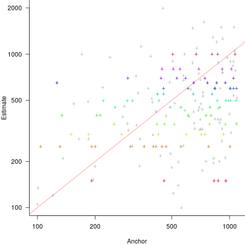
explains 11% of the variance in the data. If the higher/lower choice is included the model, 44% of the variance is explained; higher equation is: Estimate=169+1.1*Anchor and lower equation is: Estimate=169+0.36*Anchor (a multiplicative model has a similar goodness of fit), i.e., the anchor has three-times the impact when it is thought to be an underestimate.

How much would estimation accuracy improve if subjects’ were given the option of being rewarded for more accurate answers, and no anchor is present?

A second experiment offered subjects the choice of either an unconditional payment of $2.50 or a payment of $5.00 if their answer was in the top 50% of estimates made (labelled as the risk condition).

The 196 subjects saw up to seven images (65 only saw one), with the number of dots varying from 310 to 8,200. The plot below shows actual number of dots against estimated dots, for all subjects; blue/green line shows Estimate == Actual, and red line shows the fitted regression model Estimate approx Actual^{0.9} (code+data):

Actual and estimated number of dots in image seen by subjects.

The variance in the estimated number of dots is very high and increases with increasing actual dot count, however, this behavior is consistent with the increasing variance seen for images containing under 100 dots.

Estimates were not more accurate in those cases where subjects chose the risk payment option. This is not surprising, performance improvements require feedback, and subjects were not given any feedback on the accuracy of their estimates.

Of the 86 subjects estimating dots in three or more images, 44% always estimated low and 16% always high. Subjects always estimating low/high also occurs in software task estimates.

Estimation patterns previously discussed on this blog have involved estimated values below 100. This post has investigated patterns in estimates ranging from several hundred to several thousand. Patterns seen include extensive use of round numbers and increasing estimate variance with increasing actual value; all seen in previous posts.

Most percentages are more than half

Derek Jones from The Shape of Code

Most developers think …

Most editors …

Most programs …

Linguistically most is a quantifier (it’s a proportional quantifier); a word-phrase used to convey information about the number of something, e.g., all, any, lots of, more than half, most, some.

Studies of most have often compared and contrasted it with the phrase more than half; findings include: most has an upper bound (i.e., not all), and more than half has a lower bound (but no upper bound).

A corpus analysis of most (432,830 occurrences) and more than half (4,857 occurrences) found noticeable usage differences. Perhaps the study’s most interesting finding, from a software engineering perspective, was that most tended to be applied to vague and uncountable domains (i.e., there was no expectation that the population of items could be counted), while uses of more than half almost always had a ‘survey results’ interpretation (e.g., supporting data cited as collaboration for 80% of occurrences; uses of most cited data for 19% of occurrences).

Readers will be familiar with software related claims containing the most qualifier, which are actually opinions that are not grounded in substantive numeric data.

When most is used in a numeric based context, what percentage (of a population) is considered to be most (of the population)?

When deciding how to describe a proportion, a writer has the choice of using more than half, most, or another qualifier. Corpus based studies find that the distribution of most has a higher average percentage value than more than half (both are left skewed, with most peaking around 80-85%).

When asked to decide whether a phrase using a qualifier is true/false, with respect to background information (e.g., Given that 55% of the birlers are enciad, is it true that: Most of the birlers are enciad?), do people treat most and more than half as being equivalent?

A study by Denić and Szymanik addressed this question. Subjects (200 took part, with results from 30 were excluded for various reasons) saw a statement involving a made-up object and verb, such as: “55% of the birlers are enciad.” They then saw a sentence containing either most or more than half, that was either upward-entailing (e.g., “More than half of the birlers are enciad.”), or downward-entailing (e.g., “It is not the case that more than half of the birlers are enciad.”); most/more than half and upward/downward entailing creates four possible kinds of sentence. Subjects were asked to respond true/false.

The percentage appearing in the first sentence of the two seen by subjects varied, e.g., “44% of the tiklets are hullaw.”, “12% of the puggles are entand.”, “68% of the plipers are sesare.” The percentage boundary where each subjects’ true/false answer switched was calculated (i.e., the mean of the percentages present in the questions’ each side of true/false boundary; often these values were 46% and 52%, whose average is 49; this is an artefact of the question wording).

The plot below shows the number of subjects whose true/false boundary occurred at a given percentage (code+data):

Number of subjects whose true/false boundary occurred at a given percentage.

When asked, the majority of subjects had a 50% boundary for most/more than half+upward/downward. A downward entailment causes some subjects to lower their 50% boundary.

So now we know (subject to replication). Most people are likely to agree that 50% is the boundary for most/more than half, but some people think that the boundary percentage is higher for most.

When asked to write a sentence, percentages above 50% attract more mosts than more than halfs.

Most is preferred when discussing vague and uncountable domains; more than half is used when data is involved.